CSS Coding Course
CSS 101
Part 9a. Page Layout Tools
Layout Techniques
We have already learned a lot about web development. Just knowing how to use divs with classes and ids to distinguish them from one another gives us a firm base to build upon. We have also learned about nested divs which is also very helpful, especially when we use flexbox techniques to arrange those divs in rows and columns on our web pages. But there are several other ways to do page layouts — some older and some newer — that can be extremely helpful toward building great websites and web pages.
In this part, we will learn about tables. Tables give us a great way to display data. And these days, the beauty of using simple tables is often overlooked. Sometimes tables can be difficult to display on mobile devices, and that is why some developers are critical of their use. However, we will show you how to create tables that work, regardless of the screen widthS of the devices that will ultimately be displaying them.
And we will also learn about six different ways to position elements on your web pages. This is an important concept that we haven't really talked about yet.
We will also learn about semantic elements, which is a better and more descriptive way to label divisions in our web pages.
We will also learn how to take advantage of flexbox layout techniques to make our code more mobile responsive. And we will learn about media queries which is the failsafe way to ensure a more mobile-responsive website. That is all coming up next, so let's jump right in!
Tables
Did you know that in the early days of web development, HTML tables were heavily used for page layout purposes? Back in those days, table elements served the same role that div elements serve today. Tables were the standard approach for structuring web pages due to the lack of advanced CSS support.
In the mid-1990s to the early 2000s, tables were the de facto standard layout tools for web development. Web browsers had limited support for CSS, so developers nested tables inside of other tables to achieve precise layouts. And each table had to have its own inline style tags and elements, so HTML document code often became quite cluttered and messy.
In the early 2000s, CSS started to grow in popularity, and as web browser support for CSS increased, web developers began to shift from table-based page layouts to div-based page layouts. The trend to separate HTML content from CSS styling was well underway. And by the mid-2000's, CSS had matured to the point that CSS2 was released, which introduced positioning properties. But hardware devices were rapidly advancing as well, so code that was mobile-reponsive was also highly desirable. And in the late 2000s, CSS3 started to address those concerns. In 2012, support for CSS Flexbox was released. And in 2017, CSS Grid was released as well, so the need for using tables to layout web pages was basically over.
Nevertheless, bad ideas sometimes die slowly. To this day, tables are still the preferred way to send stylized web pages as emails. And this is mostly due to email clients (like Microsoft Outlook) that have notoriously limited and inconsistent support for modern CSS features, especially Flexbox and CSS Grid. And as a result, most email developers continue to rely on table-based layouts to ensure their designs display consistently across a wide variety of email clients (even web-based email clients like Yahoo and Gmail). But please don't let this news agitate you because we are not going to learn these antiquated skills and techniques. And hopefully you will never be asked to develop HTML-based emails.
However, table elements are still used today especially for efficiently and aesthetically displaying tabular data, while div elements, along with modern CSS styling techniques, remain the primary structural building blocks for web page layouts.
Let's Table This Discussion
Sorry about the long history lesson. Let's see some actual HTML tables so that we know what we are talking about here. Yes, you've probably seen these before, but we wanted to show you a couple of easy examples first.
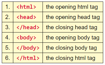
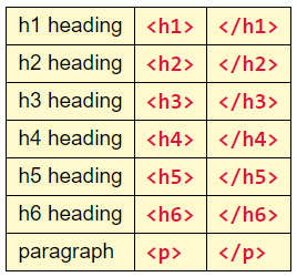
Try not to yawn. The table above and the table below were both taken directly from the HTML Crash Course - Part 1 so the content covered is not as important as the HTML and CSS structural layout of these two tables. So now let's download this Two Tables project so that we can unzip it and then open it in VS Code.
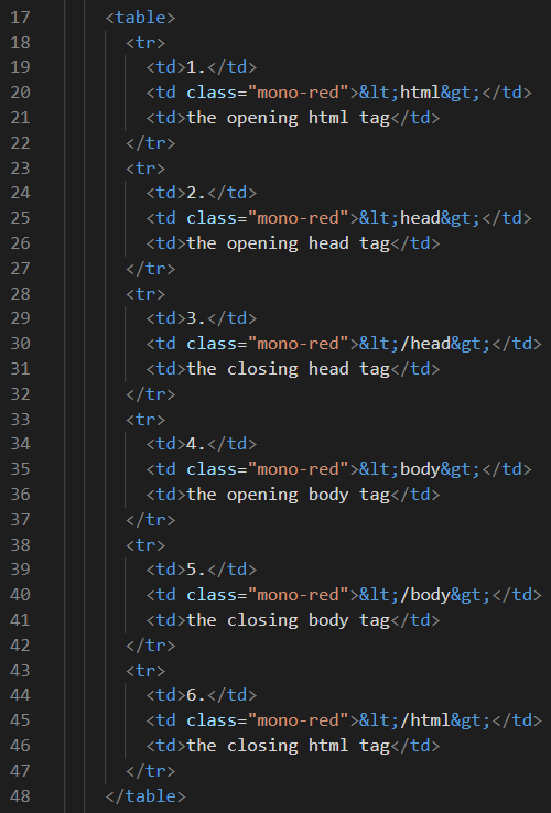
First off, let's examine the HTML code required to create the first table. On line 17, we have an opening <table> tag. And on line 48, we have a closing </table> tag. The code between these two tags is obviously the contents of the table. Notice that this table has six rows and three columns of data. The table rows are enclosed within opening and closing <tr> tags, and table data in each row is enclosed within opening and closing <td> tags. And just FYI, each one of these pieces of table data is called a cell. Therefore, this table consists of eighteen cells. And In this table, the first row starts on line 18 and ends on line 22. The three cells of data in the first row are on lines 19, 20, and 21. So the layout of this table is all very neat and tidy.
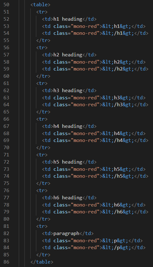
The second table is just as easy to understand. The opening and closing table tags are on lines 50 and 86. This table has seven rows and three columns of data, or twenty-one cells. Finding each row and the data inside of each row is a breeze. Oh yeah! The < and > thingies you see embedded in those cells are special characters for the less than and greater than symbols that you know better as angle brackets. We use them constantly when typing HTML code which requires lots of < and > symbols. And since those characters have a special purpose in HTML, you must use special character codes if you want to see them on your web pages. Otherwise, you will completely confuse your web browser.
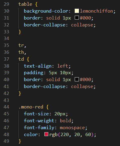
Lastly, let's examine the utter simplicity of the CSS code required to render these two tables. There is nothing unique about the background-color, border rules, or padding. However, we have not seen CSS rules for border-collapse before. And the default CSS for border-collapse is separate rather than collapse. So if you comment out lines 32 and 41, you will get to see what separate cells look like. One last thing before we move on is on line 36. It seems that we have defined the same CSS rules for th (table header) as for tr and td, even though these tables had no table headers. You will see table headers in the next few projects. About the only thing that makes a th different from a td is that a th defaults to font-weight: bold while a td defaults to font-weight: normal. Piece of cake, right? Let's put a piece of cake on your table today!
Now It's Your Turn!
For the next project, we are going to give you some of the code, but we want you and Emmet to write some of the code as well. Remember Emmet? He's our buddy, and we will show you why right now! But before we can start, you will need to download this starter code for the Great Lakes Project. You know the drill. When the project is open in VS Code, we can begin.
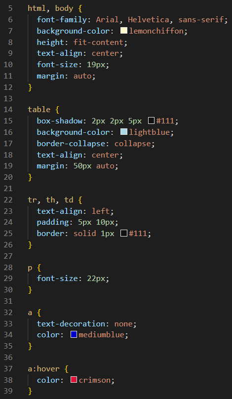
The CSS code is already done for you. But let's take a quick look at the CSS rules anyway, especially those CSS rules for the table tags and elements on lines 14 through 26.
Also, you will notice that two text files were added to this project folder for your convenience. They are called instructions.txt and table-data.txt. And there is also a graphics image you can open in VS Code called instructions.png. Now before we go any further, make sure you have the index.html file open in VS Code so we can begin. Step-by-step instructions follow.
- On line 15 of index.html, type table, and then press the tab key.
- The cursor is now between the two table tags. Press the enter key.
- You are now on line 16 between those two table tags you just created.
- Now type tr>th*4 and then press the tab key.
- The step above creates 1 set of table row tags with 4 sets of table header tags inside it.
- Move your cursor to the end of the </tr> tag on line 21. Press the enter key.
- You are now on line 22 between the </tr> tag and the </table> tag.
- Now type tr*5>td*4 and then press the tab key.
- The step above creates 5 sets of table row tags with 4 sets of table data tags inside of each row.
- You should now have a table framework that starts on line 15 and ends on line 52.
- The last step is to copy and paste the table header text and the table data text from table-data.txt file into the appropriate cells in your table.
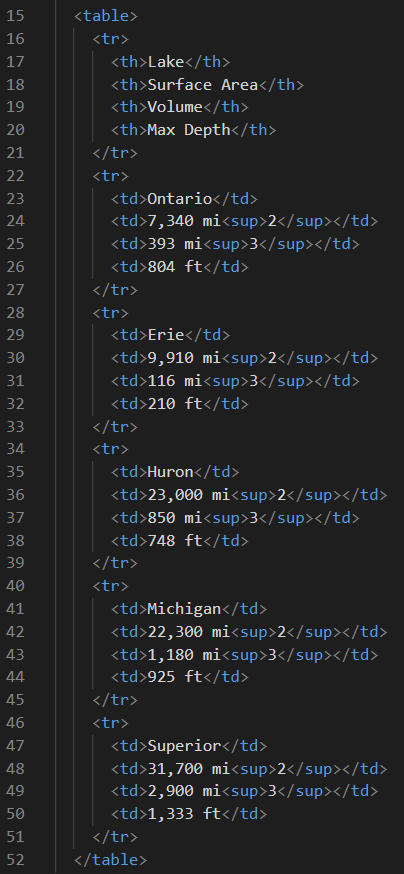
Notice that the <sup>2</sup> code creates the superscript 2 for square miles as mi2, and that the <sup>3</sup> code creates the superscript 3 for cubic miles as mi3. Also notice that we are using table headers in the top row of our table, which makes the font-weight bold by default. When you have completed this project, you will have a website with a table that looks something like this.
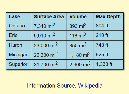
Wow! Let's admire your good work for a moment.
- Which one of the Great Lakes is the shallowest?
- Which Great Lake is the deepest?
- Which one is the largest in area?
- And which lake is the smallest in area?
- Which two are almost the same size in surface area?
- Which Great Lake holds the most water?
- Which one holds the least amount of water?
- Does it make sense that Lake Ontario is so deep? Why?
- And lastly, if you emptied all of the the water out of Lake Superior, how many Lake Eries would it take to refill it?
Rowspan & Colspan
In this next project, we want you to learn how to span rows, columns, and both rows and columns at the same time. So without further ado, please download this Rowspan & Colspan project. When you have it open in VS Code, we will continue.
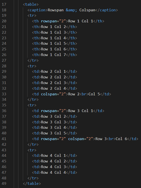
First, let's take a look at the HTML table code on lines 17 through 49 of the index.html file. This table should consist of 4 rows with 7 columns in each row. But we are going to span some of those rows and columns, and that is the whole point of doing this project in the first place. So without spans, this table should consist of (drumroll please) 28 cells, right?
But already we are seeing something new on line 18, which is a caption element complete with opening and closing tags. Inside those tags and in the middle of this caption is a special character, and it is the special character code for an ampersand or &. Much like the special character codes for the two angle brackets, the ampersand also has special meaning to HTML, so it must also be written as & if you want to see it appear on your web page.
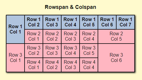
Also notice that the first row has table header tags instead of table data tags, which means that the first row by default will appear in bold font-weight, rather than in normal font-weight. But there is something exciting happening on lines 20, 33, 36, and 41. The th on line 20 will span 2 rows. And the td on line 33 will span 2 columns. Plus, the td on line 36 will also span 2 rows. And the td on line 41 will span 2 rows and it will also span 2 columns. This is also one of those rare instances where we used break tags. You will find 2 <br> tags here: one on line 33; and one on line 41. Nothing can destroy your mobile-friendly web page faster than misplaced break tags. But in these two instances, they actually work quite well.
The result of spanning rows and columns appears below. It should easy to tell the table headers from the table data. And it should also be easy to spot the 4 spanning cells. And look at how these cells are identified by both Row number and by Col number. But spanning has reduced the number of cells from 28 cells to 22 cells. Can you figure out where those other 6 cells went? And can you explain why there is no Row 2 Col 6, Row 2 Col 7, Row 3 Col 7, Row 4 Col 5, Row 4 Col 6, or Row 4 Col 7 ? Is it possible that spanning has eliminated the need for these 6 cells completely?
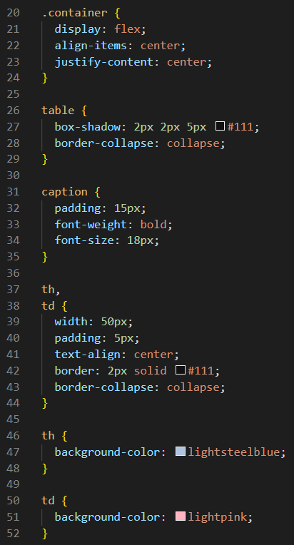
Let's also take a quick gander at the CSS for this table. There are only a couple of things that stand out here (pun intended). This table has a box-shadow that makes it stand out on line 27. The rather straightforward CSS rules for caption are on lines 31 through 35. Giving all of the unspanned cells the same width on line 39 seems to make sense here. Of course spanned cells will cover more than one cell width, depending on how many rows or columns were spanned. And just for fun, we changed the background-color of both the table header cells and the table data cells. That happens on lines 46 through 52.
The Named HTML Colors Project
You probably saw this project before if you did the CSS Coding Course - Part 6 which was completely devoted to Color. This table is a useful tool for selecting colors for a web page. It shows All 148 Named HTML Colors listed by Color Name in alphabetical order. But it also displays the Hex Value, the RGB Value, and the Actual Color for each one. To download this project as a ZIP file, click here. We are not going to spend a lot of time on the code for this project because we believe that you already know the fundamentals required to create your own tables. Nevertheless, we encourage you to look over the code in this project to see if there is anything you can learn from it. Several of the games we will build in the JavaScript Coding Course use tables, so it is worth your time to get familiar with them now.
Positioning Elements
On this topic, we will describe six different ways to position elements on your web page. And we will explain the advantages and disadvantages of each way. You will also learn why at least two of these ways are usually combined to better position a child element inside of a parent element.
The six ways to position elements we will discuss here are:
- fixed positioning
- sticky positioning
- static positioning
- initial positioning
- relative positioning
- absolute positioning
These ways to position your elements can be very powerful. But with great power comes great responsibility. Thanks to the fine folks at W3Schools, we have this quick example to help illustrate how each one of these ways works, without the help of the other ways to position elements, or the position coordinates that are usually required to properly position an element. Let's try each one of these ways to see what they do, shall we?
OK, it starts out with static positioning. And just FYI, that is the default position for all HTML elements. And static remains the default position until we change it. So now, let's click on the radio button for absolute. If your radio button disappeared behind the element, that's what is supposed to happen. We'll get into why that happened a little later. But, the important part of the lesson here is that, when we change the position from its static default, we need to use initial positioning to put it back to where it was initially, so let's click the initial radio button to make that happen. Ah, that's better!
And it may seem like static positioning and initial positioning are exactly the same thing. But if you look at the CSS code, you will see that we use different terms. Always remember that we only use initial after we change it from static to something else, if we want it to return to its original static position. And we hope that makes perfect sense to you. This little demo app doesn't illustrate that very well, but that's the truth of the matter.
Next, let's click on the fixed position radio button. The result might seem unexpected. You might be thinking that broken might be a better descriptor than fixed. And just to illustrate another unexpected result, let's click on the relative radio button. Well, that seems a little better. At least this time, our target element did not stray too far from its original location. But what we aren't telling you right now is that fixed and absolute especially, usually have other position coordinates assigned as well. And also, we have not explained that absolute positioning is generally being referenced to an element defined with relative positioning. We try to think of it this way: This element relates absolutely to its nearest relative. Notice that when we clicked on relative, our element stayed within the div where it originated. But without a relative to tell it where to go, fixed strayed all the way to the left side of the web page, and that seems absolutely ridiculous. This will all make sense soon.
We have not mentioned sticky positioning yet, but that is mostly because this little demo app does not scroll. In order to demonstrate sticky positioning, you need to have a web page that scrolls. We are certain you've seen these before. On any website that has a navbar at the top of the page that sticks to the top of the page as you scroll down, you are dealing with a sticky navbar. But a navbar that does not move with the page as you scroll down would be considered as fixed to the top of the web page.
All of these ways of positioning elements are best illustrated through working example projects, so let's go there next.
Positioning Example Projects
We need a better example than the quick example offered by W3Schools above. For that reason alone, we decided to create this project. Yes, it looks like a mess right now, but we need you to fix it. Your job will be to make the eye on the right look like the eye on the left. And to do that, you will be using CSS positioning rules. And before you can do that, you'll need to download The Eyes Project, and unzip it into the CSS Coding Course folder that is inside you Documents folder. Then, you will need to open it in VS code.
First, let's look at the index.html file.
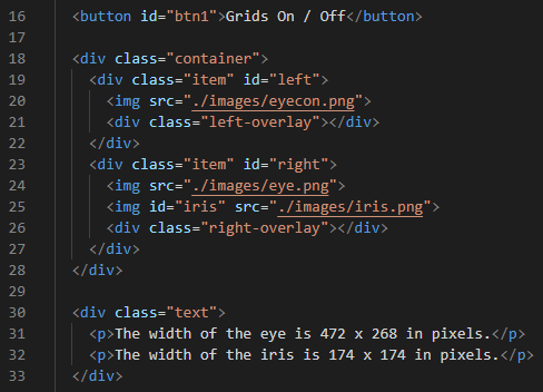
This is all simple HTML content that you've seen before. There is a button at the top of the web page that allows you to turn the grids on and off. After that, there is a container div that contains two item divs inside of it: one for the eye on the left, and one for the eye on the right. These divs also have a left-overlay div, and a right-overlay div. These two overlay divs are used to provide positioning for our grids, but that won't be our main focus. Our main focus will be on lines 23 and 25, as we attempt to properly center the iris inside the eye on the right. And to accomplish that, we will use CSS. So let's look at some CSS code next.
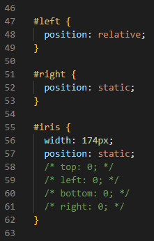
And it appears that our main focus will be a rather narrow focus since there are CSS rules here for only three elements: the div with an id of left, the div with an id of right, and an image with an id of iris. And obviously the eye on the left looks fine, so there is no need to mess with it. After all, the div on the left contains a complete image of the eyeball we are trying to duplicate on the right using CSS positioning rules. We need to fix whatever is wrong with line 52: the eye on the right. And if we felt really inventive, we could try changing line 52 to something like position: fixed; or position: absolute;. After all, you can't really break it worse than it already is. But the big clue here is that, if the left eye is using the CSS positiong rule of position: relative;, then maybe we should try that to see what happens.
But nothing much changed after we did that. However, it does look better than it did with fixed and absolute positioning rules. And it looks pretty much like it did when we were using static. But one thing that has changed is that the grid now aligns with the right eye when you toggle it on and off. So we must be doing something right. But if you look down at line 72, which is the CSS rule for positioning the left-overlay and the right-overlay, we see that the CSS positioning rule there is position: absolute;. And if the grid likes it, then maybe the iris will like it as well. So let's change the rule on line 57 to position: absolute; as well. And that did have the desired effect of placing the two eyes next to each other. But poor little iris is still not where she needs to be.
The Eyes Project
There are a few things to know about absolute positioning. For one thing, any such element that is positioned absolutely must be relatively referenced to another nearby element. In this case, our iris is inside of the right div, so that's how we know who her nearest relative is. And the right-overlay is also related to the right div as well. Obviously, the left eye and the left-overlay are related to the left div. But how does the right-overlay know where to place the grid? After all, it is perfectly positioned over the right eye. The answer can be found on lines 75 and 76. Those are the coordinates that tell CSS where to position the grid. Those lines say top: 0; and left: 0;, and those coordinates tell CSS to position the grid absolutely in the top, left-hand corner of its relative div, which in this case is the right div.

The other thing you need to know about absolute positioning coordinates is that you should reference only one vertical coordinate, and one horizontal coordinate. In the case of the right-overlay, it is referencing the top vertically and the left horizontally. Alternatively, it could have referenced the bottom vertically instead of the top, and/or it could have referenced the right horizontally instead of the left. Also trying to position elements absolutely needs to be precise, so we generally use pixels (px) or rems (px) instead of percentages (%). Now, if you look at the commented-out lines of 58, 59, 60, and 61, you will see two vertical and two horizontal coordinates that you can uncomment one-by-one to see how the iris is being repositioned. Toggling the grids on and off will also help you position the iris. Once you decide which horizontal and vertical coordinates you are going to use, you will change the values of them to position the iris inside the right eye. When you have the iris perfectly aligned, it should look identical to the left eye, which means that you just learned how to do relative and absolute positioning.
The Lists Project
Now let's take another look at a project we looked at towards the end of Part 5. The Good Stuff called The Lists Project. You should have already downloaded and unzipped that project. But just in case you did not, here is another zipped-up copy of the source code. We will not spend much time on this project right now, but we will take a look at how we used relative and absolute positioning.
If you look at the index.html file, you will see that we created fifteen divs, each with a class called list. And at the end of each div, there is a <p> paragraph with a class called num. Each of these paragraphs is assigned a number from 1 to 15.
Now let's look at the style.css file. On line 31, we see that each class called list was assigned position: relative; for each of the fifteen lists. And we can also see that on line 61 that each class called num was assigned position: absolute; for each of the numbers corresponding to each of the fifteen lists. And then on lines 65 and 66, we see absolute positioning coordinates of top: -10px; and right: 8px;. And we can also plainly see that both of these coordinates together place a crimson-colored number in the upper right-hand corner of each list. Isn't it amazing what four simple lines of CSS code can do?
The Envelope Project
First, let's download the required zip file. By now, you know what to do with that. And then, let's look at the unfinished project to see what it looks like before you fix everything that is wrong with it.
This project is a lot like The Eyes Project, except that it has three elements that need absolute positioning. But now that you already know how to do that, this project will be a piece of cake. And no grid system will be required since we already know where to place the mailing address, the return address label, and the postage stamp. All three of these elements are relative to which other element? We'll give you three guesses, and the first two don't count. You will need to add positioning rules to make that happen on one of the blank lines in the style.css file. And you will need to add positioning rules for the mailing address, the return address label, and the postage stamp. Again, you won't need grids to make this happen. When you are done, the envelope on the top of the web page will look identical to the envelope on the bottom of the web page. This is mostly just practice. Good Luck!
The Analog Clocks Projects
We suspect that you found The Envelope Project to be rather easy. So now, we have a whole series of other projects called The Analog Clocks Projects, but we need to start off with the simplest one first. The Analog Clock - Test 0 project also has only three elements that require CSS positioning rules... but with a couple of twists (pun intended). For this project, we will be introducing you to CSS rules for transform: rotate(); and also z-index as mini-lessons.
Z-Index
Whether you realized it or not, The Eyes Project actually uses a z-index: 5; rule for the two grids that were aptly named left-overlay and right-overlay. Since all elements on a web page have a default position of static, you can use a z-index rule with a higher number to place another properly positioned element in front of other elements, and you can also use a z-index rule with a lower number to place another properly positioned element behind other elements on your web pages. Try to think of z-index as adding a third dimension to your otherwise two-dimensional web page. In other words, if x is the horizontal dimension, and y is the vertical dimension, then z is the imaginary third dimension that adds depth or height to your obviously flat web page, and hence the name z-index refers to that dimension.
In The Analog Clocks Projects, we use a z-index: 1; rule for the seconds hand on the clock, and we use a z-index: 2; rule for the hours hand on the clock, and we use a z-index: 3; rule for the minutes hand on the clock. We found that using three z-index CSS rules stacks these three elements best for a better looking presentation. When you get into these projects, you will find that there are some little white and gray pixels along the edges of the three clock hands. Although these artifacts are not usually desirable, you may find that they are helpful to you as you attempt to properly position these three elements.
Transform: Rotate()
An entire CSS chapter could be devoted to Transforms. There are an amazing number of special effects that you can create using them. The W3Schools website has great tutorials on 2D Transforms and even 3D Transforms, but we are going to be very boring and only investigate the 2D Transform Rotate function. What this function allows you to do is to rotate any element clockwise some number of degrees from 0 to 359, or counter-clockwise some number of degrees from -1 to -359. Regardless of which direction you decide to rotate an element, it might end up at the same place. For instance, 0 degrees is also 360 degrees and 720 degrees. Likewise, rotating an element -90 degrees will place it in the same location as rotating it 270 degrees. There is a whole lot more to know about transforms and the rotate function, especially if you are going to create animations using JavaScript, but once again, that's a lesson for another time. This is enough information to get us into this first lesson.
Analog Clocks - Test 0
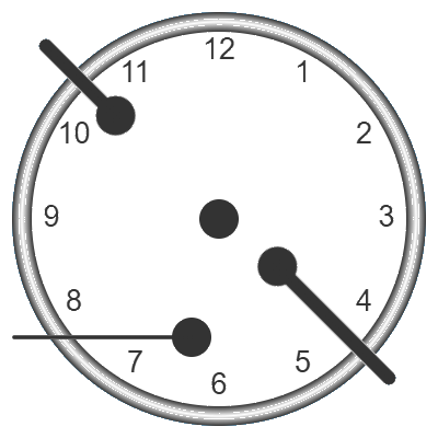
This project is an introductory tutorial to help you get started. The are nine more exercises in the main project, but we want to help you learn how to do this with as little pain as possible. However, the first step is to download the zipped-up source code, unzip it, and open it in VS Code. And when you do that, and open the project with Live Server, you will find that there are two clocks: the one on top is obviously a huge mess like the one illustrated here on the right side of this paragraph. The clock on the bottom is what we want the top clock to identically resemble after we position the three clock hands correctly. Between the two clocks is the current time displayed below. So let's jump right in.
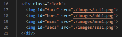
The relevant HTML code is actually pretty simple. There is a div with a class called clock on line 16 that is positioned relative to the other three elements that we are much more concerned with. And they are on line 18, 19, and 20. They also have the ids of hors, mins, and secs, which are descriptive names, even when abbreviated and misspelled.
Now let's look at the relevant CSS code that shows how these three elements are currently positioned and rotated. Whoever wrote the CSS stylesheet for this project was kind enough to add comments for each of the three elements. By now, this code should not seem foreign to us. But there are some clues here that we need to pick up on. The first line in each declaration should us the z-index value for each one. That clearly places the mins in front of the hors which is placed in front of the secs. The next two lines show us the width and height of each element. Notice that each image is a perfect square. That must mean that most of the image has a transparent background, even though each hand of the clock looks like a long and narrow black stick to us. After that, we see that each element has absolute positioning relative to the clock div. And see how each element uses a coordinate system that includes one horizontal coodinate in pixels, and one vertical coodinate in pixels as well. And lastly, there is a declaration of the transform: rotate() function with a parameter value in degrees of rotation. What should that rotation value be if each clock hand needs to point straight up?
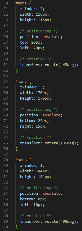
The programmer also added some more comments to help us. Since we are programmers and not physicists, our own personal knowledge of circular motion may be limited. So hopefully, these comments will help us out as well.
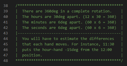
The rest is up to you. Make changes to the CSS code here until the clock on the top looks just like the clock on the bottom. One other helpful hint we will offer you is that you should do the rotation first before you change the coordinates for absolute positioning. Remember that each element is a perfect square so rotating it after you position it will require having to position it all over again. Good Luck!
The Analog Clocks Project
Test 0 is only the beginning. How did you do? If you were able to figure it out on your own, then you are well on you way to mastering the fine art of relative and absolute positioning. However, if you got stuck and were unable to figure it out on your own, help is available. If you change line 9 of the index.html file to use the style1.css stylesheet instead of the current one, then the complete solution will be revealed. Please review it carefully to determine why you failed.
But Test 0 is only the first exercise of ten that are available in The Analog Clocks Project. And you will need to click here to download the entire project. Since you already know the complete solution to Test 0, you can skip that one, or use it for review. And admittedly, it might become quite boring and redundant to do all ten of these exercises, but we would like to encourage you to do at least one from each of the three categories of Easiest, Medium, and Hardest. And since the index.html file for this project is only the menu page, the actual HTML code for all ten projects is found in the test.html file.
But you will not need to concern yourself with either of the HTML files. The real magic that creates the menu page and each test is accomplished by the script.js JavaScript file, and we are trying not to mention JavaScript at all during this CSS Coding Course.
The important thing to know here is that, just like in Test 0, you will edit only the style.css file. And the code is actually identical to the CSS code we had in Test 0 with one exception: lines 50 through 90 (the lines we need to edit) are now numbered as lines 77 through 117. And that means that these lines will change with each test that you take. So let's say that you have completed Test 1, and then you have decided to take Test 5. When you start the test, you will find that the Test 1 clock is now on top, rather than the randomly positioned clock hands you had during Test 1. And you may be thinking to yourself, 'Oh cool! I'll just change the rotation values for each clock hand!' But actually, that does not work because each clock hand rotates around the center of the image, not around the center of the clock face. So take your time and do this right. Remember that this is only a learning exercise. And hopefully, you will enjoy solving each one of these puzzles.
Pepperoni Pizza
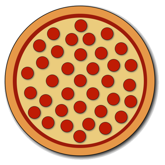
Everybody loves pepperoni pizza, right? OK, so the vegans and vegetarians are frowning right now. And that's OK because we are only going to look at the code for a pepperoni pizza. Eating it is off the table (pun intended). Let's download this project as a zip-file and open it in VS Code. And after you do that and open it with Live Server, it will look like this. And rather than spending a lot of time on this project, we will let you discover the code behind it on your own.
However, the HTML is actually very simple. We have a div with a class called pizza, and nested inside of it is a div with a class called sauce, and nested inside of it is a div with a class called cheese, and nested inside of it are 36 divs with a class called pepperoni. And just to save time, the crust and the pizza are actually considered to be part of the same div.
Now let's look at the CSS code. As you have probably already suspected, all of the ingredients on our pizza relate to the pizza itself. So it should come as no surprise that the pizza class is declared as position: relative; on line 28. That means that each ingredient is declared as position: absolute; and given coordinates that place it in a particular location that relates well to its parent: the almighty pizza. And when building a pizza, we know that we need to layer each ingredient on our pizza. On top of the crust, we evenly spread the delicious, rich red tomato sauce (with z-index: 1;). Next, we spread the blend of grated Italian cheese over that (with z-index: 2;). And before we slide it into the oven, we need to position each of the 36 slices of pepperoni randomly but uniformly over the top (with z-index: 3;).
Something else you may notice is that, even though each slice of pepperoni was assigned a number in our HTML code, those numbers do not appear on our pizza. And that is because of CSS line 61 that states color: transparent;. The web developer used these numbers when they were randomly positioning each slice of pepperoni, and if you comment out line 61, those number will once again appear. Isn't that clever?
The Nth-Child Pseudo-Class
Oh, but wait! What is all of this pepperoni:nth-child(n) nonsense on lines 66 through 244? Ah yes! That is categorized as a structural pseudo-class in the CSS Selectors Level 3 specification. And let's be honest here. If you were the parent of 36 identical children, you'd need some way to keep track of them. And that is basically what this pseudo-class does for us. And the nth-child(n) pseudo-class is one of those rare occasions where we begin counting with 1 instead of with 0, which is the norm in computer science. And obviously, the n in nth-child(n) refers to the number assigned to each nth-child.
So why are we just now hearing about pseudo-classes? Actually, you've been using them all along, but you were unaware that they had a name. For instance, a:hover is a pseudo-class. In fact, anytime you see a colon between two words (with no spaces) in a CSS property, like a:hover, you are dealing with a pseudo-class. And there are lots of pseudo-classes to learn about. Take a look at this Pseudo-Class Reference from W3Schools.
And, if you ever see two colons (with no spaces) in a CSS property, like p::before, that is called a pseudo-element. Similar to pseudo-classes, there is a lot to learn about pseudo-elements. This Pseudo-Elements Reference from W3Schools will explain what they are all about as well. The ::before and ::after pseudo-elements are actually used frequently these days. But we apologize for opening up these two deep rabbit holes, just when you were beginning to get excited about enjoying your pepperoni pizza.
The Produce Shed
Another project we looked at towards the end of Part 5. The Good Stuff was called The Produce Shed. And if you recall, we only mentioned it briefly when we were talking about the Simple Navbar Project. So why are we looking at this project again now? Because we promised you that we would talk about the differences between position: fixed; and position: sticky;. And navbars and headers are two of the places where you are most likely to find both.
The Produce Shed is actually two projects in one. One version has a fixed header, and the other version has a sticky header. And to quickly see what we are talking about here, click on the Fixed Header Version link to see it, and click on the Sticky Header Version link to see the differences. We will dive into the code behind these two versions soon. But for now, just play with the navbar buttons on each version side-by-side to see how each header behaves. You can also click on the Simple Navbar link to compare it against these two vastly improved Produce Shed versions.
One thing that you will notice immediately is that the Simple Navbar consists of five separate web pages, while the Produce Shed consists of only one. So each time you click on a link on the simple navbar, it simply loads a different web page. On the other hand, we are using a smooth-scrolling technique on the single-page Produce Shed and that makes it seem much more dynamic even though it's really just a product of the one-page design, and one line of code that creates this effect.
Another big difference between the Produce Shed and the Simple Navbar is how each one behaves when you refresh the web page. For instance, click on Page 4 of the Simple Navbar and then refresh your web browser. Notice that it does not revert back to the Home Page. Instead, it stays on Page 4 which displays the Peaches. And that's just a consequence of using a five-page design as opposed to a one-page design that employs links and smooth-scrolling.
Oh, but wait! We never mentioned the differences between the two versions of the Produce Shed. One version of the Produce Shed has a fixed header, while the other version has a sticky header. And just what do we mean by that? Well, a fixed header is fixed to one position on the web page (usually the top). So as the web page scrolls up and down, the header does not scroll along with the web page that it is is attached to. However, a sticky header sticks to the web page it is attached to. And it definitely does scroll along with the the web page that it is is attached to.
And what about the navbar? Ah yes! In both versions, it is fixed. So regardless of the behavior of the header, the navbar remains in the same position, regardless of the wildly scrolling movements of its parental header, or the web page itself.
So now it's time to download the source code to see how it works. And once we have it unzipped and opened in VS Code, then we can dive right in.
Fixed Header
The first file we need to look at is index.html. Even though this project is two projects in one, after it is unzipped and opened. we can see that it is configured for a Fixed Header right out of the box. And how to we know that? Because line 9 is uncommented, and line 10 is commented out. Line 9 says <link rel="stylesheet" href="./fixed.css">.

But we also need to look at lines 54 and 55 as well. Line 54 is uncommented, while line 55 is commented out, and the code on line 54 says <script src="./fixed.js"></script>.

And why is this important? Because instead of the usual style.css file for CSS, and the script.js file for JavaScript, we very intentionally renamed the two files used for the fixed header to reflect those names. Likewise, we have similarly renamed the two files used for the sticky header. So to switch between fixed and sticky, you only need to comment or uncomment the appropriate lines of code. And we hope that makes perfect sense to you.
Anyway, since we are working with the fixed header, let's look at the CSS code in the fixed.css file. So now, take a look at lines 29 and 30. When we are working with the fixed header, we need to add padding-top: 150px; to the document body. And the comment of line 30 confirms that. And of course, we cannot have fixed header unless we add position: fixed; on line 38, and the comment on line 39 is there to remind us why. And if we look at line 40, we can see that we want to position the fixed header at the the very top of the web page. Line 41 is there just to make sure that this header in front of any other elements on our web page.
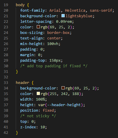
Now let's look at the fixed.js file to see what JavaScript code is required to properly display this fixed header. When combined with the other code in this script file, this little bit of code repositions the document viewport, and it also specifies the vertical pixel position it should scroll to. Let's remember that the header is fixed, so only the document viewport will scroll. And the value of 50 seems to position it correctly.
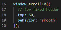
We are only showing you the code that is relevant to creating a fixed header. There is a lot more great code here that should interest you. But this lesson would become very boring if we decided to explain every single line of code. Anyway, this is how the code works for a fixed header. Now let's look at the code required for a sticky header.
Sticky Header
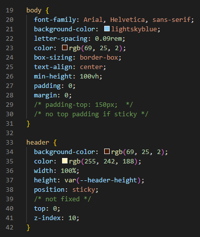
In order to magically transform this project from a project with a fixed header to a project with a sticky header, we need to comment out and uncomment four lines of code in the index.html file. From the two illustrations below, you should be able to accomplish this task on your own without our help.


Once that is done correctly, your project should now have a sticky header. Now let's look at the CSS code in the sticky.css file. Notice from lines 29 and 30 that we do not need the 150px of top padding for a sticky header, so we simply comment out line 29, and the note on line 30 reminds us why. But we cannot possibly have a sticky header without line 38 that states position: sticky;. Other than the comment on line 39, the rest of the code remains unchanged.
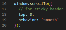
But one other difference between the sticky header and the fixed header is revealed in the sticky.js JavaScript file. On line 18, we need to set the value to 0 rather than to 50 like we did for our fixed header. And once again, everything else is coded exactly the same.
Fixed Navbar
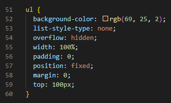
We have been so busy looking the headers that we completely forgot to mention that, regardless of whether the header is fixed or sticky, we are using a fixed navbar for both. So let's briefly look at that code as well. But we did not call it a navbar specifically, because it is technically an unordered list or ul { }. And if you look at the HTML file, you will see that the navbar is actually nested inside the header in both cases. That would normally make it a child of the header, which would normally be its parent. But since it's a fixed navbar, it inherits nothing from the header, and can operate independently. Anyway, lines 57 and 59 show us that the fixed navbar will be vertically positioned at 100 pixels.
Menus & Navbars
The immense topic of creating navigation menus is a huge lesson all in itself. However, our friends at W3Schools have one of the most comphensive How-To guides on the subject at How-To Menus, which lists over 50 different ways to create menus and navigation bars for just about any possible project you could think of. And yes of course, they explain how to create a Sticky Navbar as well as a Fixed Menu. So please take the time to visit their website and discover these almost endless possibilities.
CSS Reset
And we have one more thing to look at before we move on. If you look at line 8 of the index.html file, and before either of the other stylesheets (the fixed.css file or the sticky.css file), you will find this line of code: <link rel="stylesheet" href="./reset.css">. That stylesheet is what is called a CSS Reset. When our projects start getting long and complicated, we sometimes use this file to reset any quirks in the CSS before we add more CSS rules from another stylesheet.
And as much as we'd love to take credit for being so ingenious, this CSS was actually written by Josh W. Comeau. In reality, we are using an earlier version of his code. And Mr. Comeau regular updates this file as he discovers better ways to do a CSS Reset. Nevertheless, you can read his explanation for why each line of this most recent version of the file is important. And just to follow up on an earlier discussion about pseudo-classes and pseudo-elements, the first two CSS rules in this Modern CSS Reset stylesheet have examples of both.
Parallax Scrolling
We have spent a lot of time and effort here explaining the various techniques for positioning elements in the foreground. But we can also use a form of fixed positioning on elements in the background to create one version of parallax scrolling. There are other versions, but we will learn about this version now.
First, let's take a look at this project now. If there is a slight delay in the project loading, that is because we are using a JavaScript function to preload all 14 background images before HTML attempts to display them on the screen. Once the web page opens, you can scroll up and down the web page to see how each one of these 14 background images is displayed. Another important thing to know is that each of these 14 background images is fixed, while the foreground elements are static. And always try to remember that all HTML elements are statically positioned by default. Therefore, it is redundant to state that in our code. And we will see that after we download the source code, and then unzip it and open it using VS Code.
The HTML code is actually quite simple. We won't bother to show you all 14 divs that have a class named sunny, because they are all basically the same, with for the exception of the parallax div near the bottom of each one, which has a unique id that is named p01 through p14. For this first sunny div, this all happens on line 20.
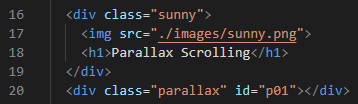
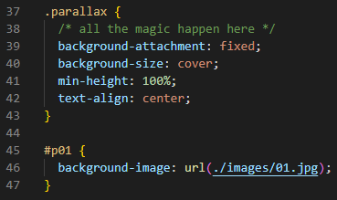
Now let's look at the CSS code, which is where all of the magic happens. In fact, line 38 tells us it's magic, so I guess we will need to trust the programmer on this. However, line 39 states background-attachment: fixed;, and when you combine that with the other code in the parallax class, we get 14 background images that are fixed in order to the back of the web page. And that allows all of the other static elements to scroll over top of them. In reality, the top part of each sunny class could contain any kind of content you like. But we simply placed a little sunny image here, alongside of an h1. It's a simple design used to illustrate one way to create a project that uses parallax scrolling.
And starting on line 45, we define which background image will be displayed for each sunny class, as defined by its #p01 through #p14 identifier.
Your Final Exam
If that seemed like it was a lot of material to cover, that's because it definitely was! But before we move on to Sematic Elements, we'd like you to take this final exam on absolute positioning. It's actually very simple. And just like on The Eyes Project, it has grid overlays to help you decide where to properly position the four items to make the image on the left look identical to the image on the right. You can use pixels or percentages for your positioning coordinates. This exam also includes an instructions.txt text file that you can read if you need more information. So download this project now, and begin. We know you can do it.
Semantic Elements
Now that we've exhausted the subject of tables, it's time to move on to the subject of semantic elements. Actually, one of the best online guides for information about HTML Semantic Elements can be found on this W3schools Tutorial web page. This tutorial covers 13 different semantic elements, but we will concentrate our study on the 7 most commonly-used subset of these tags and elements.
So... what is the actual definition of semantics anyway? If we look the term up on Wikipedia, we might find that we are traveling down into a deep rabbit hole. But in the simplest of terms, sematics is the study of meaning in a language. And in our specific case, we are referring to the HyperText Markup Language. So it only makes sense that we should have descriptive names for the divisions in our web pages. Using class and id names certainly helps. But what if we had a set of more descriptive tag names for the structure and layout of our web pages? And since necessity is the mother of invention, we already have semantic elements to help us solve this problem. So that will be the subject of this discussion.
And learning this subject is way easier than you thought! Let's look at two differently-coded websites that actually look identical to each other. First, let's open this non-semantic elements website in a new tab on our web browser, and then open up this semantic elements website in a new tab right next to it. See the difference? No, we don't suppose you do see a difference because the code is almost identical in both websites, with several tiny exceptions. To understand this completely, you might need to download the code for both projects and look at each one. Here is the zipped code for the non-semantic elements website. And here is the zipped code for the semantic elements website.
But whether you dive deeply into the code for both of these two websites or not, there is a very simple explanation for the differences between the two: one uses semantic elements and the other one uses non-semantic elements as illustrated in the two charts below. Notice that non-semantic elements are simply divs that have class names attached to them. That should make it abundantly clear that it is much easier to use semantic elements when appropriate, rather than their non-semantic div relatives.
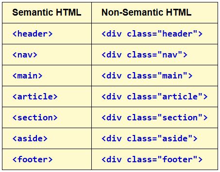
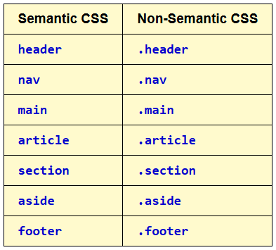
We already know the purposes of a header, a footer, and a navigation bar, so we won't explain them further here. The concepts of a main, article, section, and aside might be new to you. But through simple semantics, you can probably guess their purposes. And there are only a few rules to know and follow when using semantic elements. You can have as many of these semantic elements in an html document as you like. However, there should only be one main. And in the event that you have more than one semantic element like a nav, you still might need to assign a class or an id to it, if each one will be styled differently. Lastly, you can nest articles inside of sections, or you can nest sections inside of articles. It really makes no difference. In this website, we nested sections inside of one article, and we nested the article and the aside inside the main. It is your choice how you want to nest these elements. One last thing to mention is that our nav on this website has no links to other web pages, but you already know how to add links.
Flexbox
We've been talking about flexbox or the display: flex; property all along. That started as early as Part 5. The Good Stuff. In the Plane Geometry project, we introduced you to flexbox, and showed you how to make that website mobile-responsive easily by using the flexbox property of flex-wrap: wrap;. And we also introduced you to the align-items and justify-content properties of flexbox. It is actually amazing how much you can do with just a few simple flexbox properties.
Also in Part 5. The Good Stuff, we talked about other display properties beside flex including block, inline, and inline-block, especially as they relate to the default CSS display properties of certain elements and tags. And we added several projects there that introduced you to each one of these, but most important was the Display Review Project which explained the differences with examples, and even employed flexbox to make it mobile-responsive as well, whether you noticed that or not. And if you'd like to see the code we used, you can download that project here.
We also quickly mentioned display: none; and display: grid;, but grid can seem especially complicated, so our advice about learning grid is to tackle that subject after you've mastered almost everything else there is to learn about CSS.
Important! Make sure you understand everything that was taught in Part 5. The Good Stuff before moving on, or you may find that you are confused over concepts that are ordinarily quite easy to grasp and understand. OK?
The Best Flexbox Video Tutorial
Brad Schiff has created a great video tutorial on flexbox, and he claims that you can learn it in 30 minutes. Well, we think you'll need to spend significantly more time than that to learn it well. Nevertheless, this video is absolutely magical! And it illustrates six real-world web development layout problems that can be easily solved using flexbox. You'll need to download his starter code and do the exercises along with him. That starter code can be found here. You already know the drill. Just download it into your CSS Coding Course folder inside your Documents folder, then unzip it, and open it with VS Code. Then, open this tutorial video, and follow along.
Flexbox Froggy
Codepip has created a free game to help you learn about flexbox, and it is called Flexbox Froggy. It is fun, challenging, and educational all at the same time. There are 24 levels with each one building on the level before it. The goal of each level is to place the appropriately colored froggy (or froggies) on their matching lilypad(s). Most people can get through the first 23 levels without much difficulty. However, level 24 is the hardest one of all. If you can solve that one on your own, then you are truly a Flexbox Master. So give this game a try, amd have fun while you learn about flexbox.
Oh, do you need help on Flexbox Froggy level 24? Did you try every possible solution you could think of? Well, OK then. Drag your mouse with the left-button down over blue box below to highlight the three lines of hidden text. Then, copy and paste those three lines into the three required lines of Flexbox Froggy level 24. Did that work? Now click the red Next button to see the dancing froggies!
flex-flow: column-reverse wrap-reverse;
justify-content: center;
align-content: space-between;
Eight Planets
We have learned a lot about flexbox already. And if you've been paying close attention, you found us using flexbox rules through several of our projects already. But let's do another project and look at these flexbox rules again to see exactly how they work. So go ahead and download, unzip, and open in VS Code the Eight Planets project. When you open it with Live Server, it will look like this.
Now let's look at the HTML code in the document body. Believe it or not, this is about as simple as it gets. We have an opening container div tag on line 16 with a class named planets. Its closing div tag can be found on line 41. Between these two div tags, we have eight item divs with two class names for each one. Each one has a planet class and another class that is numbered between p1 and p8. Obviously, each of these item divs hold an image of the planet it represents. But we also position an h4 element inside each planet div to identify the planet by name. Thats all of the HTML code in a nutshell.
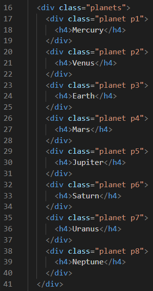
Now let's look at the CSS code for this project. It should be much of a surprise that the background color for the entire HTML document is black. That happens on line 6. For the entire document body, we are seeing the color to lawngreen. That will make those h4 elements really stand out.
Now the fun begins. On lines 17 through 25, we have more CSS rules for each of the h4 elements. And this is old-fashioned way to center an element both horizontally and vertically inside of a div. So it's a good thing that we previously covered absolute positioning. On line 19, we tell CSS to use absolute positioning. Then on line 21, we set the top to 50%. And on line 22, we set the left to 50%. Wouldn't that alone be sufficient to center the h4 element in both directions? Well, it would if the h4 element had no width or height. But since that's not possible, the h4 element is skewed to the right and down a little too far as well. To see if that's true, you can always comment out line 23. But make sure you uncomment it after you see this, because this transform: translate(-50%, -50%); CSS rule is the magic potion that centers it perfectly regardless of the h4 element's width and height. THe last thing to mention is on line 24 where we add a little bit of text shadow to each h4 element to make it stand out more.
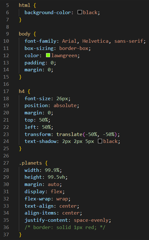
Now let's look at lines 27 through 37 above, which defines the CSS rules for the container div that we named with a class called planets. We could have called this container anything we like including belgian-waffles, but we chose the name planets because it was the most logical name for this div. Lines 28 and 29 are quick estimates of the amount of width and height this container will need. There are better ways to determine that, and we will learn those ways later.
The magic of flexbox is on lines 31 through 35. On line 31, we specify display: flex;. Then on line 32, we need to set the flex-wrap property to wrap. In a moment we will see how that allows for two rows of four planets in each row. Simple. Actually, lines 33 and 30 center this container div on the web page, so these are not flexbox rules at all. However, lines 34 and 35 definitely are flexbox rules. Line 34 says to center-align the items inside the flexbox container vertically. And line 35 says to put space between the items inside the flexbox container horizontally. To see the boundaries of this flexbox container, you can uncomment line 36.
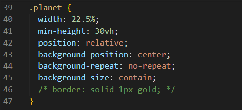
Now let's look at the CSS rules above for all of the item divs that are defined with the class name of planet. We know there are eight of them. On line 40, we assign a width of 22.5%. And the reason for that width is because the container div named planets has a width of 99.9%. A value of this width comfortably allows for four item divs before the flex-wrap: wrap; rule forces the next four item divs to the next row. On line 41, we set the minimum height to 30vh, which means 30% of the vertical height. This also provides nice spacing between what has now become two rows, even though in reality, it is only one row wrapped. Line 42 sets position: relative; and that established a reference point for each planet so that the h4 element that is the name of each planet can be positioned absolutely. Don't forget that each planet has a background image as well as a name. Line 43 positions that background image in the center of the item div. Line 44 ensure that the image does repeat. We only need one image of each planet. Line 45 says to contain each image inside the item div. We don't want it to grow larger than the size of the div that hold each planet image. And finally, line 46 could be uncommented if you want to see the boundaries of each planet div.
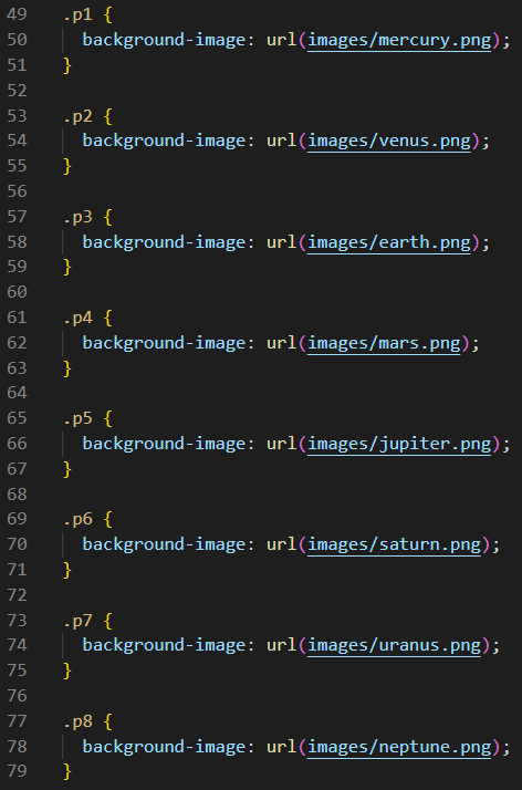
But don't forget that we assigned two class names to each planet div. And p1 through p8 assign a background image file to each planet div. For instance, p8 assigns the image file at neptune.png in the images folder as the background image for the eighth planet. As we stated earlier, this is about as simple as it gets when trying to explain how flexbox works.
Version 2
We hope you learned a lot from this previous example. But in Eight Planets Version 2, you will learn newer and more modern ways to do what we just taught you. Version 1 was not a waste of time. But it was important to see how that done. You may find that the modern ways are more complicated and harder to understand, but we hope not. In fact, we will only discuss the differences in code from Version 1, so don't feel like we are wasting you time! You will see why these ways are the best ways.
Of course, you know the drill. Jump right in and download, unzip, and open in VS Code, the following project zip file. It looks identical to Version 1, so no project preview is required. When you get this project open with Live Server, we can begin.
As for the HTML code only one line is different. In Version 1, line 8 was a line of obsolete code that instructed Internet Explorer to render the web page using its latest available rendering engine of Microsoft Edge. So we replaced line 8 with a link to our favorite CSS Reset file: <link rel="stylesheet" href="./reset.css">. Nothing else in the HTML code has changed. However, what changed in CSS is displayed below.
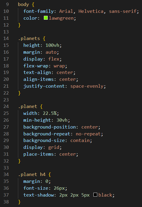
Notice that we no longer need a bunch of redundant CSS rules for the document body because that was covered by the link to the CSS Reset file we just mentioned. Five lines of code are now reduced to only two (lines 10 and 11). Next, let's compare the rules for the h4 elements. In Version 1, we spoke of the old-fashioned way to center an element both horizontally and vertically inside of a div. In Version 2, this is the more modern way as shown above on lines 35 through 37. In Version 1, we had to use seven lines of code for absolute positioning. And the reason for this major change has everything to do with the planet rules on lines 30 and 31. All of that old relative and absolute positioning nonsense, and the transform translate nonsense was replaced by two lines of code. To center all of those h4 elements, we simply tell CSS to display: grid; and place-items: center;. That doesn't mean that we can forget everything we just learned about flexbox because it is going to be replaced by grid. Grid can get very complicated so it is not something that beginners need to learn. Learn flexbox well. You will use that a lot. But remember this handy little grid trick for centering elements both horizontally and vertically inside of of divs.
Summary
We definitely covered a lot of material in this part. But before we go on, let's quickly review all of the subjects we covered here. This part of the CSS Coding Course dealt with Page Layout Tools, which is a huge topic to be sure. And for which, we really only scratched the surface.
In this part, we introduced Tables, a subject that was previously neglected. We learned about table rows and table data, and how to style each cell, especially by using padding and border-collapse CSS rules. We learned the difference between table headers and table data. In addition, we learned how to customize our tables by spanning columns and rows. Tables are still relevant in web development today, even though some would argue that flexbox can now replace tables, now that all web pages must be completely mobile-friendly. But we also covered a deeper dive into Flexbox at the end of this part, and we will cover Mobile Responsiveness in the next part.
After Tables, we covered the topic of Positioning Elements, for which there are six different ways to accomplish that task. And we had lots of example projects to help you learn these techniques. We also introduced you to some other subjects along the way, such as Z-Index, and the Transform: Rotate() function. And we hope you took a look at 2D Transforms and 3D Transforms as well. And we managed to talk about the Nth-Child pseudo-class as well, even though we only slightly opened the door to learning about pseudo-classes and pseudo-elements. We saw how we can use our positioning techniques on headers and navbars. We also provided a link to the W3Schools How-To Guide on Menus and Navbars, and we encourage you to investigate that topic on your own as well. There were quick sections on CSS Resets and on Parallax Scrolling Since the background can be fixed just as easily as the foreground, we can create web pages that allow for parallax scrolling as well.
Then, we learned the differences between Semantic Elements and Non-Semantic Elements, and we could see how semantic elements can be easier to use than divs with class names. And we spent more time of Flexbox, which if implemented properly, can be the greatest page layout tool of them all.
Yes, we covered a lot of ground in Part 9a. The next part will focus on making your web pages more mobile-reponsive. But before we get started on that subject that everyone hates, we want you to know that making all of your web pages 100% pixel perfect for every possible device is not your goal here. Instead it is important to design web pages that are mobile-responsive without adding lines and lines of media queries. If we could whisper an industry secret here... "That's a job for AI. Make them do it!" So get ready for Part 9b.