CSS Coding Course
CSS 101
Part 8b. Text & Fonts
But Wait! There's More!
In previous lessons, we talked a lot about fonts as they apply to the printing industry as well as to web development. There was a lot to learn about font-families, fallback fonts, and about Default CSS. For instance, we now know that the default fallback font-family is serif, and that the default font-weight is bold for headings, but that the default font-weight is normal for paragraphs. And we should also know that the default font-style is normal, rather than italic or oblique. We also explored what the default font-sizes were for all six headings and for paragraphs. And we learned that we can pretty much change all of the above if we want something with better styling than merely the defaults. Yet there is still more to know about font-size, font-weight, and font-style properties and values in CSS, so we will tackle those subjects (and more) next.
Measurement Units
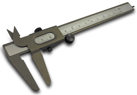
As we will soon learn, we can use many different units of measurement to size the elements and the space between them on our web pages. So far, we have mostly used pixels for sizing. But occasionally we used percentages, either followed by the percent sign %, or followed by the designation of vh or vw as they apply to viewport height and viewport width, respectively. But CSS offers an enormous variety of ways to size elements and the space between them, and there are probably too many ways to be useful in actual practice. We will mention the ways of sizing that you are most likely to encounter, and the advantages and drawbacks of using each one. Plus, we will recommend and prescribe which ones are considered to be the most useful in best practice.
But before we dive in too deep, it would be remiss of us not to mention that the measurement units we will be discussing can be applied to more values than simply those used in the font-size properties of our elements. They can also be used as values in the properties of width, height, max-width, max-height, min-width, min-height, padding, margin, line-height, letter-spacing, border, outline, text-shadow, and box-shadow to name more than a few. And when we say units of measurement, we mean units of linear measurement like length (or height, if we are describing length in a vertical direction). And lastly, there are two basic types of measurements: relative and absolute. And relative measurements can be sized differently depending on whether they are related to their parent element, or to the root element (which is a fancy way of saying the html document). But don't get too concerned if this seems like TMI. We will discuss these topics one-by-one in a manner that adds clarity for your complete understanding.
Font Size
There are many different units of measurement for font-size, and so far we have explained that points are a common unit of measurement used in printing and word processing. Printed text needs to have a fixed size on paper, and therefore the sizes of these fonts must be absolute.
However, we generally measure the font sizes on web pages in pixels (but not always), and we will get into that next. Remember that pixel sizes can all be quite different from device to device. In reality, screen sizes and pixel densities often vary greatly from large desktop monitors, to laptop screens, to tablet computers, to mobile phones. And there is no "one size fits all" when it comes to pixels. So for screens, we measure font-size in myriad different ways.
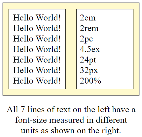
Let's download an exercise to illustrate some different units to measure and specify font-size. As usual, after you download and unzip the project file to a folder, open it in VS Code so you can see what is happening here, as pictured on the right. And if you would prefer to view this project without first downloading it, unzipping it, and opening it in VS Code, then simply click here. These seven paragraphs of text on the left all look the same, and they are. But each paragraph was created by using seven different units of font-size measurement, as described on the right. Some of these are absolute, and some are relative. Let's take these one by one, starting from the bottom.
The seventh paragraph has a font-size of 200 percent. We would write that as font-size: 200%;. "But 200% of what?" you must be asking. Ah yes, 200% of the default font-size for a paragraph, which you should now remember is 16 pixels. So 200% of that is 32 pixels, which seems to match what we see on the line above that one. The sixth paragraph has a font-size of 32 pixels. We would write that as font-size: 32px; and the result is as expected.
However, in the paragraph above that one, the fifth paragraph, we have a font-size of 24 points. And we would write that as font-size: 24pt;. And we can see from the result that it appears that, by default, we can create the same font-size by using a number of points like 24. But that is only true if you are viewing this on a screen that calculates PPI (or pixels-per-inch) at 96 PPI. In other words, you might get different results from this code on your own screen! Let's not forget that the measurement of points is a standard of the printing industry and the word processing world. In their world, which is based on DPI (or dots-per-inch), there are 72 DPI, and each dot is called a point. So let's do some simple arithmetic here. In the case of DPI, 24 / 72 = one-third of an inch. But in the case of PPI, 32 / 96 = one-third of an inch. So you can see here from these calculations that this only works if your screen has a pixel density of 96 DPI. After all, points are based on physical dimensions and therefore are always the same size when printed on paper. And pixels are based on the pixel density of your screen resolution and your browser settings. For that reason alone, you should avoid using points as a measurement unless of course, you are doing media queries for a print device instead of a screen device. Please remember that, for the most part, we are trying to convince you that using pixels is preferable to using points for reasons that we will enumerate several times throughout this course.
The units of measurement get trickier from here. So aren't you glad that we started at the bottom first? Now let's jump back to the first paragraph. The first paragraph has a font-size of 2 "ems". And we would write that as font-size: 2em;. The original design idea behind the em was that it should be the width of the uppercase letter "M" in the default font-family and font-size of its parent. But the font-size of the em changes every time its parent element is styled with a different font-size, and that can really confuse anyone who hasn't worked with "ems" before. In other words, the em font-size can change several times in a long HTML document that uses "ems" several times, and that can be a very annoying behavior that is extremely hard to control. Plus there are two things wrong with this designation. The first objectionable issue is that em is also the name of the inline HTML tag that means emphasis. And unless it is changed by CSS, its default behavior is to print the text between the opening and closing em tags in italics. And if you think that is a silly naming convention, then you are not alone! But "ems" also have the second much bigger problem in that the font-size of an em is relative to its parent element. And as we stated earlier, if the font-size changes from one parent to the next, it affects the font-size of each child element, until eventually, we have a font-size nightmare is completely out of control.
The solution to not crying while screaming "Auntie Em! Auntie Em!", is to avoid using "ems" entirely. And somewhere over the rainbow and along the yellow brick road, the rem was created as an alternative for "ems". In CSS, the term rem means "root em", and we apologize for not discussing the root element yet, but we promise that this topic is coming up very soon. But for now, all you really need to know is that a rem does not change each and every time that somebody styles a parent element with a different font-size before it. And of course, you will notice from the code in our example that the first paragraph has the exact same font-size as the second paragraph, and that is because it has no other parent element before it with a changed font-size. So in this example, 2em and 2rem are the exact same font-size. And of course, we would write our rem CSS as font-size: 2rem;, and that is how we defined the second paragraph. We will revisit this conflict between "ems" and "rems" again very soon.
Now let's take a deep breath, be brave, and take a look at the third paragraph. We defined the font-size on the third paragraph as font-size: 2pc;. OK, not a problem, right? The pc must be similar to the em and rem, right? Actually, the answer is no. The pc stands for pica, and this is another throwback to the printing, typesetting, and word processing world. Picas are a fixed or an absolute font-size. There are 6 picas in an inch, so 2 picas = one-third of an inch, and that is why it appears that 2pc = 2em = 2rem, but we see that each one of these is calculated differently. Like with the point, and now with the em, we would like to strongly encourage you to never style a font-size using picas. The main reason we say this has more to do with the fact that the "X" key is right next to the "C" key on your keyboard! You might be surprised one day to find billboard-sized text in the middle of your web page, and wonder how such a horrible thing could have happened. The answer is that, if you accidentally typed font-size: 32pc; instead of font-size: 32px;, then you produced font that has a font-size equivalent to 512 pixels! And that certainly was not what you intended. We will see an example of this soon.
In the fourth paragraph, we defined the font-size as font-size: 4.5ex;. And granted, you may never see this definition, but we are including it just in case you do. Similar to how the "ems" were created as a reference length based on the uppercase letter "M", "exes" were created as a reference length based on the lowercase letter "x". Was that a silly idea? You bet! Now let's do some math here. Without a long explanation, you can see that "exes" must be 1.25 times wider than the same number of "ems" or "rems". And just like with "ems" and "rems", there is a "root ex" measurement called rex which is relative to the root element, unlike the ex which is relative to its parent element. There really isn't a whole lot more to say about "exes" and hopefully, you'll never see font-sizes defined in this way.
So to quickly summarize the main points discussed here, we will encourage you to use font-size values defined in units of rem, px, and %. Knowing when to use each will be key to your success, and we will dive into that pool shortly. However, this rule on Default CSS font-size might prove helpful: 1em = 12pt = 16px = 100%. But remember to use rem instead of em, and remember to use px instead of pt, and always try to remember why we stress this repeatedly.
Root
As a quick review, we already know the difference between the html document and the document body and how to style each of them separately or together. And we all know about our friend Mark Up, who has a head and a body and who lives in a house. But we never really talked about the firm foundation under his house. And we call that foundation under his house the root element. Since it is under his house, it is usually invisible to us. And in reality, the root and the html document are actually the same thing. But we can style a relatively default font-size in either the root or the html document. However, we usually style it in the root as we will see soon. But remember what we said about some types of font-size measurements being relative to their parent (like "ems"), and some of them being relative to the root (like "rems")? The designation rem means "root em", and the designation rex means "root ex" (just in case you ever see that font-size value being used). The main point here is that setting a font-size value in the root can have a font-size scaling effect on all of our root relative elements, and that can have a very beneficial effect when we decide that it is better to use "rems" than pixels for the sake of scalability for our mobile-friendly, web-intelligent designs.
So now that much about font-size has been discussed, let's go back to our example code exercise. Running that code will produce output that looks like the picture at the beginning of this section. But now, without changing anything else in the index.html file, let's uncomment lines 5 - 7 of our style.css file.
Thanks to Emmet, there is an easy way to comment out our code, and to uncomment it as well. Simply highlight the line or lines of code you want to comment out or uncomment, and then type Control + / on Windows, or Command + / on a Mac. When you do this the /* and the */ will either appear or disappear, and the color of that line of code will change to or from the color green.
If you are having trouble with this, remember that the Control key (or the Command key on a Mac) works just like the Shift key, meaning that you can hold that key down for as long as you want and nothing happens until you press another key while that key is depressed. And in our case, holding down Control (or Command) and then pressing the forward-slash / key repeatedly acts as a toggle that turns the comment/uncomment feature on and off.
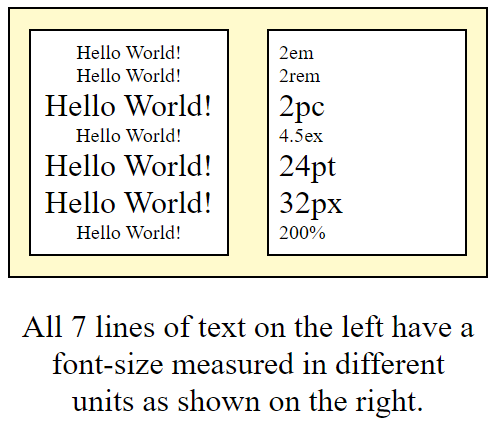
Wait a minute! What happened here? The scalability factor for four of our seven paragraphs changed! And that is because CSS :root rules only affect the font-size units of em, rem, ex, and %. Don't bother to do this, but in order to make these all the same font-size again, we would need to change four of our CSS rules. Rules for "ems" would need to change from font-size: 2em; to font-size: 3.2em;. Rules for "rems" would need to change from font-size: 2rem; to font-size: 3.2rem;. Rules for "exes" would need to change from font-size: 4.5ex; to font-size: 7.2em;. And lastly, rules for percentages would need to change from font-size: 200%; to font-size: 320%;. Or in much simpler terms, we would need to pick values that are 1.6 times greater than they were before, while pixels, points, and picas remain unchanged by changes in the scalability factor of the CSS :root rules. "And why is that?" you ask. It is because those CSS font-size rules use measurement units that are absolute rather than relative. That makes sense, right?
Notice what we did here. These are new CSS :root rules for font-size which we just placed at the very top of our other CSS rules. And this is another one of those Secrets of the Cyperspace Universe that are not taught to you soon enough! Remember the default CSS font-size rules we taught you earlier (1em = 12pt = 16px = 100%)? After we make this change to our CSS :root rules, the new CSS rules are now are: 1.0rem = 10px, and this can be extremely useful when you are converting a website styled completely in pixels to a website styled completely in rems. For instance, any rule like font-size: 32px; can be rescaled in "rems" by a factor of 10. So now, we can use a rule like font-size: 3.2rem;. And please remember why we want to use "rems" instead of "ems". It is because their sizes will not change unexpectedly later on. Eventually, you will see why we want to use this scalability factor. And this will become more apparent when we learn more about mobile-responsiveness. But for now, just remember that this cosmic web development secret exists.
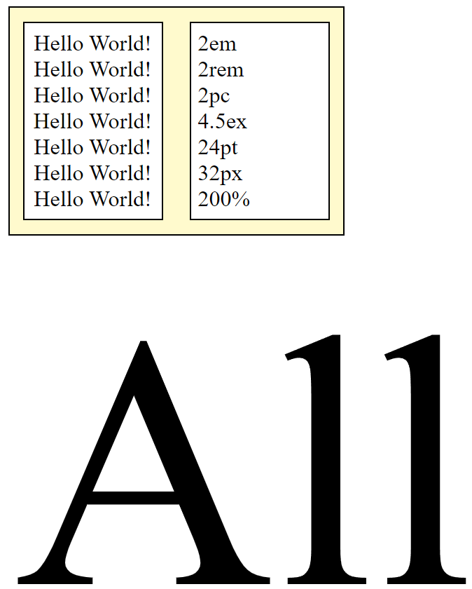
As one last experiment before we move on, let's comment lines 5 - 7 of our style.css file, so that our original scalability factor returns. Now, let's uncomment line 84 of our style.css file. Remember that your browser reads your HTML document and your CSS stylesheet from the top to the bottom. So, whether you decide to comment line 83, or not, it not really important. If you define any value for any element's property, and then you later change that value without removing the previously-defined value, CSS ignores the first value, and uses the new value it finds for the same property.
Anyway, the point of this experiment is to see first-hand what happens if you use picas instead of pixels accidentally. What this illustrates is the result of typing font-size: 32pc; instead of font-size: 32px;. The text that is produced has a font-size equivalent to 512 pixels! And that certainly was not what was intended. Once again, this sometimes happens accidentally, simply because the "C" key is right next to the "X" key on your keyboard. And when this happens, it produces these unexpectedly insane results.
Absolute & Relative Font Size Rules
As you may recall, our jobs were made so much easier by using any one of the 148 Named HTML Colors. Rather than having to define a specific RGB Value or Hex Value, we could use color names like white, black, gray, or blue. And that certain beats having to type color: rgb(255, 255, 255); each time we wanted text in the color white.
Absolute and relative font size rules were created with same kind of utter simplicity in mind. Rather than having to type font-size: 13px;, we could simply type font-size: small; in the case of using absolute font-size. And in the case of relative font-size, rather than having to type font-size: 0.83rem;, we could simply type font-size: smaller; in the case of using relative font-size.
There are eight defined types of absolute font-size:
- xx-small
- x-small
- small
- medium
- large
- x-large
- xx-large
- xxx-large
But there are only two defined types of relative font-size:
- smaller
- larger
Now let's look at two examples in code to get a better idea of what we're talking about here.
Click here to view our example code that compares Absolute Font Sizes. Notice that in this example, there are eight pairs of paragraphs with the same font-size for each, only defined in two separate ways. The top line in each pair uses one of the absolute font-size definitions, while the bottom line use a font-size defined in pixels. The only variation to this scheme is in the fourth example, where we also used a default paragraph to prove that medium and 16px were indeed the very same font-size as the default. If you would like to download the code for this example and experiment on your own, click here to download the project, and then you can unzip it and open it in VS Code to examine all the code for yourself.
Now click here to view our example code that compares Relative Font Sizes. Notice that in this example, there are only two examples of paragraphs: one for smaller, and one for larger. The top line is a normal paragraph in the default font-size. The second line uses the smaller relative font-size definition, while the bottom line use a font-size defined as 0.83rem. In the next example, we compare a normal paragraph in the default font-size against the larger relative font-size definition on the line below that. And on the bottom line, we illustrate that larger is equivalent to a font-size defined as 1.20rem. What might be unclear is that these font-sizes are fixed, meaning that you can't simply repeat lines using the smaller rule or the larger rule to repeatedly get a smaller or larger size font. Each rule will only be one size smaller or larger than the default font-size. It will never be scaled relatively smaller or larger than the line of text preceding it. That point needs to be made very clear. And if you would like to download the code for this example and experiment on your own, click here to download the project, and then you can unzip it and open it in VS Code to examine all the code for yourself.
The one thing that become immediately clear is that absolute font-size seems to be based on pixels, while relative font-size appears to be based on "rems". That makes sense because "rems" are relative to the font-size defined in the :root, whether it is still the default, or not. In other words, if the default paragraph font-size is defined as 16px, there is no equivalent font-size in pixels for font-size: smaller;. We find that 13px is too small, and 14px is too large. Perhaps we could "split" pixels and use 13.3px as a close approximation. But in reality, pixels are finite entities counted in integer values, so it is better to use the scalable units of "rems" for this resizing task. In that case, font-size: smaller; is exactly 0.83rem.
Four More Font Size Examples
To further clarify the subjects of absolute font sizes, relative font sizes, and the differences between using "ems" and "rems", we have four more example projects for you. And we will explain what is happening here with each project one-by-one. To view each of these projects, simply click on each of the links below:
In the first project called Absolute Font Sizes #1, you will see two rows and two columns. In both rows, the columns on the left are all "Hello World!" messages, and the columns on the right explain what CSS font-size rules were used to create these messages on the left. The top row is described as absolute by default and the bottom row is described as relative by default. The reason that the top row is absolute by default is because any time you use CSS rules like font-size: xx-large; or font-size: medium;, the size of the font produced will always be the font-sizes that you see here. In other words, these font-sizes are simply not scalable. On the other hand, we are using our old "heading" friends of h1 through h6 in the bottom row, so the "Hello World!" messages we see on the left side of the bottom row are using the default font-sizes for these tags. But the reason why the bottom row is relative by default is because we can always change the font-size of these tags through CSS rules in our stylesheets. Right? Hence, they are relative font-sizes by default.
In the second project called Absolute Font Sizes #2, you will see something completely different. These seven rows of text all appear to be the same font-size (and they are), even though they are in a different color and have a slight text-shadow. But each row of text uses a different absolute font-size rule to create it. Below each row of text, there is an explanation of the CSS rule used to produce the row of text above it. Whether you use font-size: 0.5in; (inches) or font-size: 1.27cm; (centimeters) or font-size: 12.7mm; (millimeters) or font-size: 50.8Q; (quarter millimeters) or font-size: 36pt; (points) or font-size: 3pc; (picas) or font-size: 48px; (pixels), you will get the same exact font-size absolutely.
In the third project called Relative Font Size Units, you will see three rows of two columns. The top row has a background-color of lightpink, the middle row has a background-color of whitesmoke, and the bottom row has a background-color of lightblue. The top row is only there for your reference since font-size: 20px is an absolute font size. However, all of the CSS rules for the second row are root relative rules using units of rem, rex, rch, rcap, ric, and rlh. And you will notice that the text in the left column of the middle row is only an approximation of 20 pixels. In reality, there are generally no direct correlations between these units of measurement and comparable font-sizes in pixels, with the exception of rems. For that reason, it is doubtful that you will ever see any of these other root-relative units ever used, but they are included here so that you know they actually exist.
The bottom lightblue row of the third project called Relative Font Size Units is much more difficult to work with because those units of measurement are relative to the size of the viewport. Just briefly, the viewport is the visible area of a web page, regardless of the screen size of the viewed device. Since viewports and mobile-responsiveness have not been explained yet, we will quickly jump through this ring of fire and move on quickly to prevent a lot of confusion. In essence, viewport relative units of measurement are harder to control than root relative units of measurements. And to illustrate this quickly, you can simply resize the browser screen on which you are currently viewing this Relative Font Size Units project, to watch how quickly the font-sizes change! For best practice, most web developers only use vw and vh as percentages for HTML elements that use width and height, respectively. But they almost never use them for font-size. Again, this is here only to show you that these viewport relative units exist.
Lastly, and perhaps most importantly, you need to see an example project that illustrates why we should always use root relative rems rather than parent relative ems. So please take a serious look at the Ems Versus Rems project. The container at the top of the page uses root relative rems. The default font-size of the root is 16px. So, for any element on our web page where we define font-size: 1rem;, the font-size will be 16px. Likewise, for any element on our web page where we define font-size: 2rem;, the font-size will be twice the size of the default, regardless of how deeply nested in other divs it is.
But this not how inheritance works for ems, because the default font-size changes with each parent in the lineage. Of course the first time we use an em, it inherits the default font-size of the root. But it then becomes the parent of any child that follows it. So you can see in the container at the bottom of the project (that uses ems) that each child div inherits a default font-size that is twice the font-size of the previous parent. And then, it becomes the parent of the next child div. From this example, you should be able to see how quickly this can become messy. If we were using rems and we wanted a font-size that was 4 times the size of the root, we would simply define that element as font-size: 4rem;. But if we were using ems, we would have to study the genealogy of our web page to determine all the generations of parents that changed the previous font-size that was originally defined by the root element. And... ain't nobody got time for dat, right? We hope that seeing this train wreck will convince you to always use root relative rems rather than parent relative ems. And that should be enough said about that subject.
If you want to download the source code for these four projects. The links to the four zip files are below:
Font Weight

By now, it should be abundantly clear why we need to use web safe fonts as opposed to system fonts that don't have common fallback font-families. But the subject of the font-weight property will help to reinforce this idea, since the majority of system fonts only have two font-weights: normal and bold.
In this next exercise, which you can view here, we will be using a Google Font called Poppins, which is a type of sans-serif font with 18 different variations. Nine of the variations have different font-weights with a font-style of normal, and it also has nine variations with a font-style of italic. But for this exercise, we will only be using the nine variations that have normal font-styles. We will talk more about font-style very soon. And we will also learn how to import Google Fonts into our projects.
As stated earlier, system fonts have two font-weights only: normal and bold. But when you import a font-family like Poppins, you suddenly have nine different font-weights to choose from. And these font-weight properties have values of 100, 200, 300, 400, 500, 600, 700, 800, and 900. These range from 100, which is a very thin font-weight, to 900, which is a very thick font-weight. And there are the other variations between these two extremes. And if you specify font-weight: 400;, you get the median font-weight which is considered normal. Yet if you specify font-weight: 700;, you get the font-weight which is considered bold. Look the code in this example code, and all of this should become very obvious to you. Also, you can download the project code here, unzip the project, and open it with VS Code, and explore the CSS code for yourself. Something that you may not have seen before is how the font-family of Poppins was imported from Google Fonts with all nine of its variations. That happens on line 5 of the style.css file. And you will see how we specified this font (and its fallback) on line 8 of the style.css file.
One last concept to mention is what you might call relative font-weight. Just as we had absolute and relative font-sizes, there are two font-weight values called lighter and bolder. And as it turns out, specifying font-weight: lighter; finds the font-weight that is three steps "lighter" than normal or 400, which is the font-weight of 100. And similarly, specifying font-weight: bolder; finds the font-weight that is three steps "bolder" than normal or 400, which is the font-weight of 700. Piece of cake, right?
Font Style
There are three different types of font-style: normal, italic, and oblique. Normal and italic text really needs no introductions. You already know what they look like. And you would specify normal as font-style: normal;, and italic as font-style: italic;. Oblique is slightly more complicated. By itself, font-style: oblique; looks identical to italic. However, you can add the angle in degrees to change its appearance. For instance, font-style: oblique 45deg; would produce text with an angle that slants 45 degrees to the right. And font-style: oblique -20deg; would produce text with an angle that slants 20 degrees to the left. But unfortunately, browser support for oblique angles is currently only supported by Mozilla Firefox. So, for now, you should avoid using oblique angles.
More Font-Related Properties
Yes, there are more. But from here, it gets a lot more complicated. If you are curious about some of the others, you might want to investigate the font-stretch property, or the font-kerning property, or the font-variant property, and there are even more lesser-used others beyond these three.
The Text-Align Property
Before we finish our discussion about font properties and the values we assign to them, let's take another quick look at the four possible text-align values. We've already seen how we can use text-align: left; to align our text along the left-side of a webpage or container div. And we've seen how we can use text-align: center; to align each line of our text in the center. There are also times when we might want to use text-align: right; to align our text along the right-side of a webpage or container. But there is also a fourth possible value and that is by using text-align: justify; to force each line of our text to align along both the left and right sides of a webpage or container.
Although it is sometimes rare to see text justified on a webpage, the publishing industry often uses justification as the de facto standard. You often see it used in columns of text in newspapers, magazines, and on the printed pages of books. We don't want you to spend a lot of time on this, but we have created a web project that allows you to play with text justification called Text Align Justify that you can download, unzip, and work with. The text on the webpage screen is designed to guide you through testing and observing how this works.
The Text-Shadow Property
Although you've already seen us use text-shadow before, it can be very important when showing text on the screen. As you've already learned, placing text on a background image with similar colors to the text itself can often camouflage the text entirely, making it blend into the background image and thus making it invisible, or at the very least, hard to read. It is also important to always place light-colored text against dark-colored backgrounds, and dark-colored text against light-colored backgrounds. But in those cases where that simply is not possible, a little bit of text-shadow can go a very long way to make the text appear to be three-dimensional. And when coded properly, that allows it to stand out in front of the background to make it a lot more readable.
The text-shadow property can have multiple values, and anywhere from two to four parameters for each of these values. And it is very easy to create a rather ugly and distracting text-shadow instead of one that improves readability. So take your time when creating text-shadows, and when you find combinations that work well, you can always reuse these winning formulas. In real life, most shadows are dark. And although CSS will allow you to use virtually any color your want, it is usually best to keep it real, by selecting text color values, and text-shadow color values that work well together.
The way to properly construct a text-shadow CSS rule is by using the following syntax:
text-shadow: x-offset-length y-offset-length blur-radius color;
For example, the following CSS rule...
text-shadow: 3px 3px 7px #333;
will produce a text-shadow with these results:
The quick brown fox jumps over the lazy dog.
The first two parameters x-offset-length and y-offset-length are required while the last two parameters of blur-radius and color are optional. However, the results you get without the optional parameters are very often undesired results.
And one can use negative values for x-offset-length and y-offset-length if you want to create a text-shadow offset on a different part of the text. These three examples illustrate that technique.
The quick brown fox jumps over the lazy dog.
The quick brown fox jumps over the lazy dog.
The quick brown fox jumps over the lazy dog.
And if are curious about how these text-shadows were coded, you can always use Inspect to view this CSS code using your Chrome DevTools. It's good practice to use these handy tools to see how other coders write their code. Hint: Look for the class names of result, result1, result2, and result3. And please notice that we are scaling our code using rems, so that each rem is ten times its normal value in pixels (i.e. — 10.0rem = 1px).
However, text-shadows are often used with headings to produce a three-dimensional effect to a line of text. And that is especially true if the line of text has a text color and a bolder font-weight. Here is an example:
One technique that usually works well is to make the blur-radius about twice as large as the x-offset-length and y-offset-length combined. That was the technique we used for the 3D text shadow above.
But you can also achieve an offset effect sometimes by setting the blur-radius to about the same size as the x-offset-length and y-offset-length values uncombined, especially when the text-shadow is applied to light-colored text on a dark-colored background. And you should try to use a negative x-offset-length and y-offset-length with a small value like only one or two pixels, with a blur-radius that is only one or two pixels as well.
And that is exactly what we did in this project. And the project code for this project is available for download as well. Notice how the white text-shadow creates an offset effect that makes each letter stand out more, creating an almost 3D effect as well.
And as you can see, you don't always have to use black as a text-shadow. Sometimes a white text-shadow works just as well, or sometimes better! A dark text-shadow used with dark text will make the text look blurry and less readable. As a web developer, it is up to you to enhance the way the text looks, not distort it. Here is an example project we used to create images for this website. Notice that we used a small white text-shadow, which in this case creates more of an inset effect than an outset effect. There are unlimited possibilities when you use your own ingenuity. The project code for this project can be downloaded as well.
If you want to see yet another project that makes good use of text-shadows, you might want to open this project that we looked at previously called The Spanner Project. And code for that project is also available for download here.
Lastly, we have a project that produces some poorly-designed text-shadows. We can't imagine any reason why you would want the source code for this project, but you can download it anyway, if you so desire.
Text Outlines
CSS does not have a built-in way to create a text-outline, so we have be be inventive with our text-shadow CSS rules to create text outlines. And for that reason, we have created two example projects for you, so that you can learn how to create text outlines on your own.
The first of these projects is called Text Outline. The purpose of this project is to teach you how to create text outlines, how use multiple parameters with both positive and negative X and Y values, and how to add text shadows to your text outlines as well. The CSS rules for each one of these examples can get quite complicated, so your ability to learn this subject vastly improves if you download and extract the project code.
The second of these projects is called Fun With Text Outlines. This project purposely places white text on a white background, and black text on a black background to prove that almost any text that would have normally been completely invisible can be rendered visible and completely readable with the addition of a little bit of text outline and text shadow. See for yourself! The project code for this second project can be downloaded and extracted from here as well.
The Box-Sizing Property
Another CSS property that we've never really talked about, but is very important to the way padding and borders behave within an element or an entire page of text is called box-sizing. There are two possible values you can assign to box-sizing, and they are border-box and content-box, which is the default CSS rule, unless you specifically assign box-sizing: border-box; to an element, or the entire document body.
With border-box, the declared height and width of an element are restricted to include all parts of the element including the text content, the padding, and the border. In other words, if you assign box-sizing: border-box; to an element, it cannot grow beyond the size of the width and height you declared for that element.
However, with content-box, the height and width of the element are not restricted to the declared height and width of the element. Instead, the element can grow to any size beyond the sizes specified by the height and width properties. For that reason, you will often see box-sizing: border-box; included as a CSS rule for the document body.
And this example illustrates these two box-sizing values better than we can explain them here in words.
Other Text Properties
The list of factors and properties that can affect the text on our web pages is almost too long to mention. But let's mention several of them quickly because they do matter in the long run. Of course, we use margin and padding when displaying text on our web pages. Remember that margin applied to any element is spacing applied outside of that element, and that padding applied to any element is spacing applied inside of that element.
We can also adjust the line-height of our text if we feel that each line is either too close together or too far apart. You might find this handy reference on line-height helpful if you are unfamiliar with this CSS property. And we would be remiss if we failed to mention letter-spacing. And just as line-height controls spacing of lines of text in a vertical direction, letter-spacing controls the horizontal spacing between individual letters of text in a line of text. You could adjust letter-spacing if you felt that the letters were compressed too close together or spaced too far from each other. What works for one font-family may not work well for another. Use this handy reference on letter-spacing to learn more.
Lastly, here is another handy reference to four more text propeties called CSS Text Effects. These include text-overflow, word-wrap, word-break, and writing-mode. Like the font-stretch, font-kerning, and font-variant properties mentioned earlier, you may never use any of these CSS properties, but these were included to complete the discussion of this topic.
Putting It All Together
And if it seemed liked that was a lot of material to cover in one lesson, that is because it actually was! But it was mostly all necessary information that we need to know before we move on. But now, we need to move on to some more practical exercises that will show you how to import web fonts (in both HTML and CSS), and how to download and use OpenType (OTF) fonts, TrueType (TTF) fonts, and WOFF/WOFF2 fonts on your web pages as well. It is not enough to simply download and install them on your local computer. If you do that, the web pages you create using those fonts will look great on your own computer's web browser, but they will undoubtedly default to the system default serif font on other peoples' web browsers. And that is actually disastrous! As professionals, we need to ensure that our web pages look good on all computers, tablets, and mobile phones, and all possible web browsers used on each. It can be challenging, but it's our goal and our job to get to at least 95% compatibility, and that is not an unrealistic goal. After all, if about 65% of all people on the web use Google Chrome (or a Chromium-based browser) as their default web browser, then you are already most of the way to that goal already, if you are testing your code on Google Chrome.
Online Privacy Concerns
Yes, yes, we've heard it all before. Google mines your data when you use their browser and their search engine. And while that may be true, do you think that Microsoft does not mine your data when you use Edge or Bing? And how about Apple when you use their Safari browser? Are you so naive that you think they don't? What this discussion all boils down to is a matter of trust. If you trust one of these companies over another, then please exercise your discriminating level of trust judiciously. But also ask yourself, "What do I have to hide anyway?" Certainly, criminals and terrorists have a lot to hide. But isn't it ironic how many of them get caught over posts they made on Facebook, X, Instagram, YouTube, TikTok, Reddit, and the list of other social media platforms that goes on and on.
Everyone has privacy concerns over the confidentiality of their identity and personal information. Most of these concerns were violated as soon as the web was invented and implemented. For instance, the use of cookies was a good idea that turned bad almost immediately. So much so, that the European Union passed a Cookie Directive law that requires websites that use cookies to give you the option of whether to accept cookies or not. Of course, the downside to this is that the information that you are seeking may not be available to you if you refuse their cookie invitations. What a bummer!
Thanks to the anger from an outraged cybercommunity, Web3 is being developed to fix this problem. And of course, the major players who have controlled the web browser marketplace for decades have downplayed its significance. They offer you incognito mode or private browsing, and VPN (virtual private network) software products to help quell your anger, but the development of Web3 technologies continues, even though full implementation is still a long way off. Privacy of your personal information will be a top priority of Web3, as well as full protection of your identity and your financial security, through online transactions possibly made through cryptocurrencies. But if the utter volatility of the crypto market is any indication of how long this transition could take, we recommend that you don't hold your breath while you wait for it.
Some people have already jumped on the bandwagon by installing the Brave Chromium-based web browser, and by setting their default search engine to DuckDuckGo. Brave appears to be much more secure than most other popular browsers, mostly because it cannot be identified on the internet, and therefore its popularity cannot be tracked, even by StatCounter GlobalStats. And that is truly impressive, considering the huge numbers of people on the internet who are currently using Brave as their default web browser. And DuckDuckGo claims that they do no telemetric data collection. And we are absolutely certain that both Google and Bing definitely do collect your data when you do your searches on their search engines.
Some security experts claim that the best internet security can be achieved by using the Tor, Mullvad, or LibreWolf web browsers, especially when used with a VPN. Sadly, these three web browsers are based on the Gecko (Mozilla) browser engine rather than on the Blink (Chromium) browser engine. And that makes them undesirable for use by web developers who should be using Chromium-based browsers for testing their code because of browser market share, and because Chromium-based browsers have superior dev tools.
But a lot depends on your level of paranoia and your need for extremely secure internet security. The Electronic Frontier Foundation or EFF has created a website that tests how well your web browser is able to Cover Your Tracks. Essentially, it can test the relative security level of your web browser in terms of whether it blocks tracking ads and blocks invisible tracking, and whether your web browser has randomized fingerprinting, which is yet another method of protecting your anonymity on the internet. It can also provide you with a Default Report and a Detailed Report of everything it is able to extrapolate from the short test it performs on your web browser. We think that most of the data it shows you is TMI, but it can help you quickly determine if you should be adding an adblocker extension to your web browser, or not.
Adding an adblocker extension to your Chrome or Chromium-based web browser is one way to defeat the Cookie Monsters. We personally dislike seeing ads of any kind on any website. But we've found that uBlock Origin Lite is one of the best adblockers out there. Did we mention that it also blocks tracking cookies as well? Well, it does that too. So click the button below if you want to add uBlock Origin Lite to your Chrome or Chromium-based web browser.
And while some will argue that everything Google creates is evil, we believe that Google's only true crime is declaring that ChromeOS is a true operating system. Otherwise, Google has changed the world with many new innovations that are now widely-accepted, and oftentimes free to the general public. After all, you can pay a fortune to use proprietary fonts on your websites. Just take a look at Adobe if you want to see capitalistic evil at work. The costs of using their Adobe Fonts Library, and their Adobe Stock Photos Library, plus the associated monthly or yearly costs for using their Creative Cloud software can be exorbitant. Adobe claims that using their Fonts Library is free, but read the fine print before you start developing using the Adobe Fonts Library. Then, compare that cost against using Google Fonts for free, and you can redefine your definition of evil. Anyway, this should help convince you that Google is not your greatest enemy. And that should be more than enough convincing information on this subject.
Moving On
This may have seemed like a long section, but we covered a lot of material on the units of measurement used on the web. We also covered font-size in ways that can be either relative or absolute. And we learned about the root element so that we could distinguish root-relative measurements from parent-relative measurements. We also covered font-weight and font-style. These are important subjects that needed to be covered before we arrive at the next place we are going. In the next section, we will learn how to use Google Fonts. We will introduce you to the font-family in a new way beyond default and fallback system and browser fonts. You will also learn the differences between static and variable font-weights, and how to download fonts so that you can use them internally in your projects. You will also learn a few different ways to link embed code to external fonts, which renders downloading fonts unnecessary. That's all coming up in the very next section.