CSS Coding Course
CSS 101
Part 10. Cascade Mastery
In this part, we will learn why our stylesheets are described as cascading. We will learn all about the three layers of the cascade, and the priorities set by specificity. We will also talk about the three HTML5 modes: standards mode, quirks mode, and almost standards mode. It is important to know the difference between these modes, because as professional web developers, we want to adhere to standards mode as much as possible. In doing so, we will learn the importance of using CSS resets to save time, and to ensure that we are always using standards mode. And we will learn how to make absolutely sure that our code is always in 100% compliance with standards mode. Plus, we will also learn about the relationships between parent elements, their child elements, and CSS rule inheritance. So let's get started.

Define Cascading
OK, so we fully understand what stylesheets are, but why do we call them cascading stylesheets? They are called cascading stylesheets because sometimes there are conflicting styles. And when there are, your web browser must cascade through the rules, much like water must cascade over the drops in a waterfall. And the way that the browser must do that is just backwards of the order we taught you back in Part 1. Intro and Part 2. More About CSS.
Way back in Part 2. More About CSS, we learned that there are actually four types of CSS rules (not three, as we claimed in Part1. Intro). And we learned that each type of CSS rules has priorities over other types of CSS rules, with the lowest priority always being the Default CSS rules that are defined by your web browser, and with the highest priority always being Inline CSS rules. That was all we needed to know back then, because we were trying to keep it simple. But in reality, it's actually a little bit more complicated than that. Besides the four types of CSS rules, there are also three layers of the cascade. And the order of the priorities is actually enforced from the top down, rather than from the bottom up.
The Three Layers of the Cascade
- Origin
- Specificity
- Source Order
And we will explore each one of these layers, one at a time.
Origin
Origin can also be broken down into three cascading priorities.
- User Agent Styles — Your web browser's Default CSS rules — the lowest priority
- User Styles — Custom user web browser settings — the second lowest priority
- Author Styles — CSS rules defined by external stylesheets, internal stylesheets, and any inline styles.
This is basically what we learned when we learned about the four types of CSS rules, except we never talked about the differences between the user agent styles and the user styles. A good example of user styles would be accessibility settings. A blind person doesn't care how pretty your website looks, but they do have a screen reader that tells them what content can be found on each web page, and where that content is located. So it only makes sense that the default CSS rules should never override the accessibility settings in this case. So basically, when the user changes the default web browser settings, those settings will override the default browser settings. The process of overriding user agent styles with user styles is an example of cascading. And from there, the process cascades into the author styles that you are much more familar to you. And author styles usually override user agent styles and user styles, with one exception that we will mention later.
Specificity
Specificity is always described using this strange notation to signify higher and lower specificity, with "1,0,0,0" being the most specific, and "0,0,0,0" being the least specific. Higher specificity always wins if multiple CSS rules target the same element. We will see some examples of this in the near future.
- 1,0,0,0 — Inline styles 🠊 style="margin: 20px;"
- 0,1,0,0 — IDs 🠊 #header
- 0,0,1,0 — Classes, Attributes, and Pseudo-classes 🠊 .container, [type="text"], :hover
- 0,0,0,1 — Elements and Pseudo-elements 🠊 h1, p, ::before
- 0,0,0,0 — Universal Selector (a.k.a. – "Wild Card") 🠊 *
Source Order
Source Order is the easiest layer of the cascade to understand, because we already know that the last CSS rule listed on our stylesheet always takes precedence over a previously-assigned CSS rule.
In other words, if we have a CSS rule for h1 that defines color: red;, and then later on in our stylesheet we have yet another h1 CSS rule that defines color: blue;, we know for a fact that all h1 elements not targeted as part of another class, ID, or inline style will be blue in color.
With One Exception
If you mark any CSS rule in your stylesheet as !important, it will override all other CSS rules for that element, regardless of whether those other rules are more specific or listed later in our stylesheet. In the example above, the color of all h1 elements would be red in color if the previously listed CSS rule was color: red !important;.
To be perfectly honest, we believe that using !important rules is (like using inline styles) a last resort. Web developers who use lots of !important rules are not actually following the standard HTML5 and CSS3 rules. But when a stylesheet reaches thousands of lines of code, we suppose some mercy is allowable. After all, if the boss or the client is impatient over the length of time being spent on a project, we all might be tempted to take a few shortcuts to get the job done in a timely manner.
The Three Modes of HTML5
HTML5 incorporates three primary modes of operation to determine how the web browser will interpret and render the HTML document. These modes help to ensure compatibility with older websites while also supporting modern web standards. These three modes used to be defined as:
- Standards Mode
- Quirks Mode
- Almost Standards Mode
However, a more modern interpretation defines these same three modes as:
- No-Quirks Mode
- Quirks Mode
- Limited Quirks Mode
Why the change in terminology? Well, it is mostly because there are two ways to look at the same issue. If you look at this from the HTML5 point-of-view, then you recognize that HTML5 is the standard from which all other modes should be judged. But if you look at this from its historial reference point, originally HTML had behavioral quirks that were actually considered to be the norm and the standard, once upon a time. In fact, back in the early days of web development, nobody considered those standard behaviors to be quirky at all. So when we use the term Standards Mode, we are actually talking about No-Quirks Mode. And we may use the terms of Almost Standards Mode and Limited Quirks Mode interchangeably as well. Whether the glass is considered half full or half empty, it still contains the same volume of liquid, correct?
Standards Mode
Standards Mode is the default mode for modern HTML5 documents. Our goal will be to always conform to these standards as much as possible. We do this because these international standard specifications were established by the World Wide Web Consortium (W3C) and the Web Hypertext Application Technology Working Group (WHATWG), which are the two authoritative organizations that maintain the technical standards, and document the specifications for HTML5 and the Document Object Model (DOM). Later on, we will show you how to test your code to make sure that it is in full compliance with Standards Mode.
However, the very first step to ensuring that you are in compliance is to always include this code on the very first line of your HTML document: <!DOCTYPE html>
This line of code is called a <!DOCTYPE> declaration, and it informs the web browser that it can interpret the rest of this document as an HTML document in Standards Mode.
Quirks Mode
Quirks Mode emulates the behavior of older web browsers and allows legacy websites (built before modern standards were established) to be displayed as they were intended, even if they do not conform to current specifications. That is how the browser can display a website like the World's First Web Page which was created by Tim Berners-Lee on August 6, 1991.
Your web browser determines if it should interpret and display a web age in Quirks Mode if the the <!DOCTYPE> declaration as described above is missing, incorrect, or simply malformed.
Almost Standards Mode
The <!DOCTYPE> declaration is the code that you write at the top of your HTML document. However, a DTD or document type definition is the standard that is defined by your declaration. After all, there were other standards and other markup languages before the adoption of the current HTML5 Standards Mode. And we will list several of these to show you just how messy this business once was.
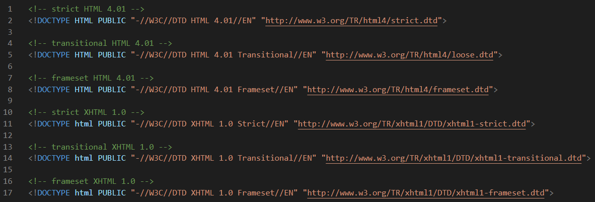
Don't forget that you can click on these images to zoom-in.
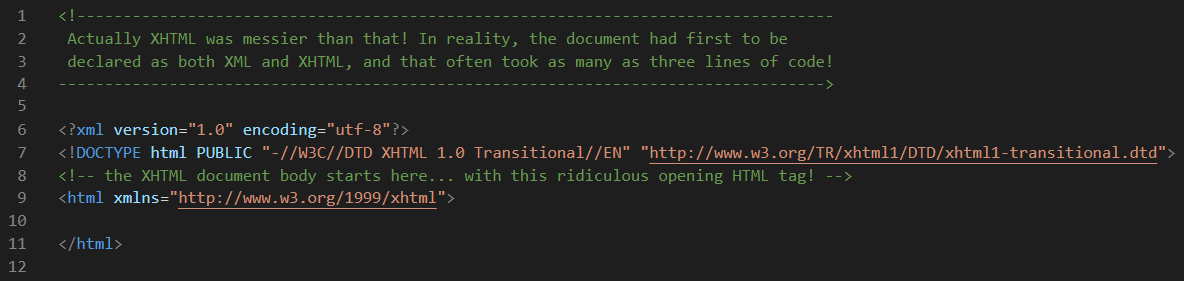
So the bottom line on Almost Standards Mode is that older websites may use these legacy DTDs. And if they do, the Default CSS rules might be quite different than for HTML5 Standards Mode or Quirks Mode. And we are beginning to see how an old and complicated legacy <!DOCTYPE> declaration could be "incorrect or malformed". Nevertheless, web browser vendors are tasked with ensuring backwards compatibility, so that websites created using these archaic standards, and that have been live and online for decades, can still be rendered by modern web browsers. And that is their problem to deal with, not ours.
A Brief History Lesson
In the beginning God, created the heavens and the earth. And then on August 6, 1991, Tim Berners-Lee created the World Wide Web. And in doing so, he also created the World Wide Web Consortium (W3C) and HTML 1.0. The evolution of HTML is a fascinating story. The W3C grappled with the task of taming and naming this evolving species as it transitioned through version numbers of HTML 2.0, HTML 3.0, HTML 3.2, and eventually HTML 4.0. But then, HTML began to interbreed with XML (eXtensible Markup Language), and the hybrid XHTML 1.0 was born.
And then, a huge battle broke out between the HTML purists and the XHTML revolutionaries. But eventually, the revolutionaries won as the W3C adopted XHTML 1.0 as the de facto standard for web development, much to the dismay of the purists. Most web developers, often begrudgingly, began developing web pages using XHTML, while many were expressing their dissatisfaction with the system. And those dark days continued on for a decade or so.
On May 28, 2019, the W3C announced that Web Hypertext Application Technology Working Group (WHATWG) would be the sole publisher of the HTML and DOM standards. And in order to right the sinking HTML ship, the standard we know today as HTML5 was adopted as the new standard for web development. And now, as incremental improvements to the HTML language are introduced and adopted, the practice of updating the version numbers as HTML 5.x has mostly been abandoned as well. The simple <!DOCTYPE> declaration of <!DOCTYPE html> is all that is required to declare your HTML document as one that adheres to Standards Mode. And they all lived happily ever after.
Test Zero
Now that we know about the three Layers of the Cascade as well as Standards Mode and Quirks Mode, it's time to put that knowledge to the test.
This first project called Test Zero is designed to illustrate some of the main differences between Standards Mode and Quirks Mode. Please remember that the web browser reacts quite differently in these two modes. And that means that the Default CSS rules for each mode can differ greatly as well. So go ahead and download this project, unzip it, and then open it in VS Code, and then Go Live in your web browser.
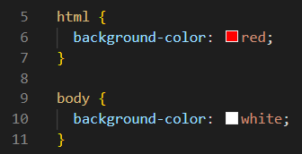
This web project has been stripped down to almost nothing, but only to prove a point. If you look at the illustration below, you will see that we only have two rules in our style.css file. And you've seen us do this before. If we set the background-color of the html document to red, and the background-color of the document body to white, we will be able to see both of these essential elements on our web page. And we will be able to see any case where the document body is unable to completely cover the entire html document.
The corresponding index.html file is also stripped down to almost barebones. Our focus will be on only two lines of code for this exercise: line 1 and line 13.
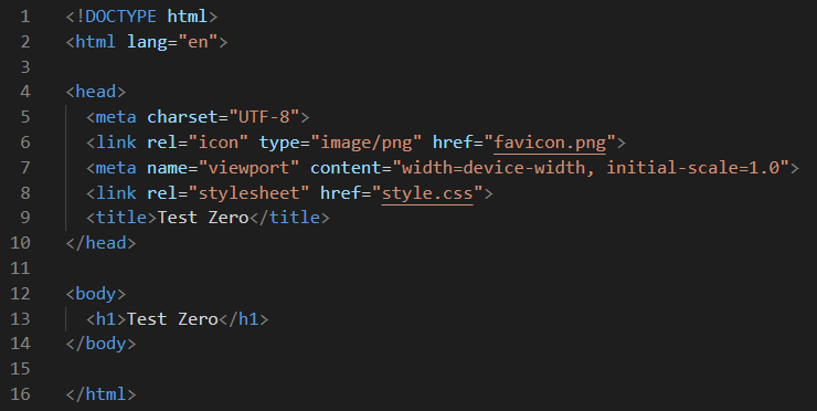
So now that you can see all of the code in these two files, let's Go Live to view this web page as is in our web browser.
Is the result shocking? It is if you were expecting most of the screen to be white rather than red. This web page is using the Default CSS rules for Standards Mode. And in Standards Mode, the document body seems to be only as large as it needs to be, with the default width seemingly set to 100% and the default height seemingly set to auto, with a little bit of default margin all around it as well. But that's not actually what is happening here at all. And it is almost impossible to "think like a web browser", so we won't even attempt to recommend that as an option to help you understand what is happening here.
The best way to understand what it is happening here is to ask the web browser directly by using our handy Chrome Dev Tools and invoking their Inspect tool. Yes, we haven't really even used our Dev Tools much up until this point, put it's never too late to learn. And just in case you need a quick refresher course on Chrome Dev Tools, you can review Part 6. Using Dev Tools in our HTML Crash Course.
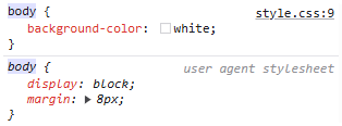
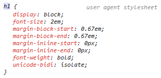
Step 1. So let's Inspect the CSS rules for the three elements as shown below.
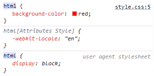
The first rule for the html document is from line 5 of our style.css file, and we totally expected that. The second rule is less obvious, but it is getting that information from line 2 of our index.html file where we declared the language we would be writing this document in as English or "en". The third rule was defined by the user agent stylesheet, which is not a stylesheet we have easy access to because it is the Default CSS rules used by the Chrome web browser at the top of the cascade. And that rule is display: block;.
And what do we know about display: block;? We know that any block-level element starts on a new line that takes up the full width that is available to it by default. Additionally, block-level elements can have margins and paddings applied, and they can contain other block-level and inline elements. The display: block; property does not change the element's intrinsic properties but rather how it is displayed within the document flow.
Now let's look at the CSS rules for the document body. And as expected, line 8 of our style.css file is telling the browser to display the document body with a background-color of white. But the next two rules are once again Default CSS rules assigned by the user agent stylesheet which is telling it to display the body as a block-level element with a margin of 8px. That seems consistent with what we are seeing.
Lastly, we need to Inspect the only other content on this web page which is the h1 element we defined. And lo and behold, we can see no fewer than eight Default CSS rules that were defined by our user agent stylesheet. Three of these rules we expected. Yes, we expect all h1 elements to be block-level elements. Yes, we also expect the font-weight to be bold by default. And since the default font-size for the so-far unchanged root element is 16px, we know that 2em is actually 32px and that is the font-size we are expecting for all h1 elements by default.
But these four margin rules may not make sense to us, even though they make perfect sense to our Chrome web browser. But in order to explain them quickly, you might need to think of margin-block-start as margin-top, and margin-block-end as margin-bottom. You might also think of margin-inline-start as margin-left, and margin-inline-end as margin-right. And if you do that and look at margins on all four sides of the h1 element, it should start making better sense. Lastly, the rule unicode-bidi: isolate; is much harder to explain, but in basic terms in means to isolate this element from other elements in the document just in case some other bidirectional unicode characters exist in this document that might be in a different language. For instance, Hebrew and Arabic characters are written from right-to-left rather than from left-to-right as we normally do in English. So this rule is telling the web browser to isolate this particular text from other text just in case some other language written in Unicode characters exists in this document. Oy vey!
Step 2. Now let's comment out line 13 in our index.html file. Then let's look at the web page again, and let's Inspect these elements again. Note: To comment out a line of code, simply click on that line of code, and type Ctrl + / on Windows, or Cmd + / on a Mac. After doing so, that line of code should look something like this:
<!-- <h1>Test Zero</h1> -->
And when we look at our web page, we will not see any white body at all! And when we inspect the CSS rules for these elements, we get:
As crazy as this may seem, according to the specifications for Standards Mode, the web browser will only display the document body if it has content. And when we took it's only content away, it collapsed into nothingness. We are ready for Step 3.
Step 3. Now let's comment out line 1 in our index.html file. Then, let's look at the web page again. Line 1 should now look like:
<!-- <!DOCTYPE html> -->
And now when we look at our web page, we see something completely different! Now most of the webpage is white with a small red margin around it. And by eliminating the <!DOCTYPE> declaration, we are now viewing this web page in Quirks Mode. So let's Inspect these elements again.
As far as the web browser is concerned the CSS rules have not changed. However, the document body is no longer collapsed now that we are in Quirks Mode. And even without any content, the browser allows it to expand to cover almost all of the screen, except for an 8px margin on all four sides.
Step 4. Now let's uncomment line 13 in our index.html file. Then let's look at the web page again, and let's Inspect these elements again.
Now the h1 element is back, and the CSS rules for it have not changed, but it is displayed exactly where it should be displayed in Quirks Mode.
Step 5. Uncomment line 1 in our index.html file. Look at the web page again. Now we are back in Standards Mode and the web page should be displayed exactly like it was displayed in Step 1.
Test Zero Conclusions
Sometimes you can learn your greatest lessons from the smallest projects that use only a tiny fraction of all the code that is possible.
One of the main lessons we learned here was that the html document is the root element of the document, and a parent to two child elements known as the document head and the document body. And we learned that the html document is a block-level element, even though it behaves quite differently than most other block-level elements. For instance, it expands to fill the entire viewport, without any default margins because that would be silly. It won't even allow you to add margins to it because (once again) that would be silly. And the html document will not shrink to fit content, even if there is no content. Instead, it will always fill the viewport in width and height, regardless of the size and shape of the viewport.
On the other hand, the document body is also a block-level element, but it also behaves quite differently than most other block-level elements. For example, it comes with a default amount of margin, whether you desire to have it or not. And there is a huge difference between the ways that Standards Mode and Quirks Mode deal with the document body. In Standards Mode, the document body will only expand in height as far as is needed to fit the content. If there is no content, then there will be no body as well. However in Quirks Mode, the document body will not shrink in height to fit content, even if there is no content. In Quirks Mode, the document body expands to cover as much of the viewport as it can, regardless of whether or not there is any content to view, except for the default amount of built-in margin surrounding the document body.
The h1 element that we added is a block-level element that behaves pretty much like all other block elements, except that the default amount of built-in margin would be significantly less if this test used a p element instead of an h1 element. This little bit of information will help us greatly when we dive into the following four topics of inheritance, margin collapse, box-sizing, and CSS resets.
But wait!
If the <html> document is considered to be the root element of the document, then what is the difference between <html> and the :root that we learned about much earlier in this course?
Ah yes! That's a great question! Basically <html> is the actual HTML element at the root of the document structure. It is a real element that you can style through CSS, and it is a real element that can interact with the DOM (Document Object Model) through JavaScript.
However, :root is not an element at all. It is the CSS pseudo-class that is the selector for the topmost element in the document tree, which in HTML just always happens to be the <html> element. So from a CSS point of view, both html and :root refer to the very same element.
But there's a twist! In CSS, html has a lower specificity than :root which is slightly more specific, and that can be helpful if you ever need to override html styles. We saw a need for this when we wanted to change the scaling factor for the entire <html> document to one where each rem was one-tenth of the value of each px. And if you recall, this was accomplished by adding this CSS rule to the top of our stylesheet: :root { font-size: 62.5%; }. Using this scaling factor, any element (like width) that is 40.0rem in size is also 400px in size as well.
Really?
Well, as fascinating as that is, it doesn't explain why the block-level elements of the html document and the document head behave so much differently than all other block-level elements.
We explained it as well as possible in the Test Zero Conclusions section above. But let's look at a chart that will summarize these behaviors.
Margin Collapse
Are you getting tired of seeing this red background in our html document? After this next exercise we might never see it again. OK? The reason it is there is because of something called margin collapse. And now we will learn what that is, and how to control it.