CSS Coding Course
CSS 101
Part 8d. Text & Fonts
Downloading & Using All Font Formats
We already established that there are several different types of font formats that we could use on our web pages, but there are some that are preferable to others because they are more compatible with modern web browsers. Without reviewing everything in Part 8a all over again, let's just take another look at this W3Schools Web Fonts Reference.
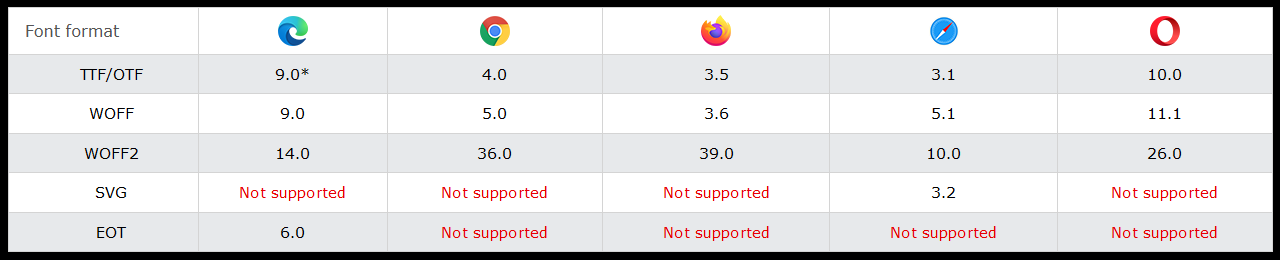
From this chart, it seems pretty obvious that we should avoid using EOT and SVG font formats. And instead, we should concentrate our efforts on using TTF, OTF, WOFF, and WOFF2 file formats. And there are exceptions, like when an SVG font format is embedded in a WOFF or WOFF2 file, which we will see later.
When using a downloaded font-family, and regardless of its font format type, you want to use the @font-face method at or near the top of your CSS stylesheet. Along with that, you will give the font-family a name, and that can be a name of your choosing, if you like. And you will specify the src of this font-face by defining a path to where the browser can find this font format file. Make sure your file has the proper file extension and format designator. And we will see many examples of this in the eight projects we will look at next.
For our purposes, a long discussion on the differences between TrueType fonts and OpenType fonts will not really help us with web development. We probably should know that TrueType fonts came before OpenType fonts. And that we need to use the correct file extension: either .ttf or .otf, as well as the correct format designator: either format('truetype') or format('opentype'). More information beyond that is not really necessary to the task of creating beautiful web pages. If you desire to have a greater understanding of these differences, then we invite you to use your Google search engine and find articles on this subject.
The Web Open Font Format (both WOFF and WOFF2 file formats) is a packaging format that encapsulates a TrueType font, an OpenType font, an SVG font, or even a variable font. WOFF2 has better file compression than WOFF, and that's about the only real difference. But this is the future of web fonts because WOFF and WOFF2 file formats are supported by all major web browsers. When downloading and using WOFF2 and WOFF files, the correct file extension must be used: either .woff2 or .woff, as well as the correct format designator: either format('woff2') or format('woff').
Let's Have Some Fun!
Now it is time to download eight font format projects that will show you how to use all of the preferred font formats mentioned above. And we will also be able to preview each project (by clicking on the links below), before actually looking at the code.
- Google Sans Fonts 1
- Google Sans Fonts 2
- Gettysburg Address 1
- Gettysburg Address 2
- Urban Font
- Fontastic
- The Mandalorian Season 3
- Google Font Effects
Let's take these projects one by one, starting with...
Google Sans Fonts 1
In this project, we used the Google Fonts user interface to select the most popular 14 sans-serif fonts in both the 400 and 700 font-weights. And we used the @import method on line 5 of the style.css file to bring all of those font styles into this project. We recommend that you take your time looking at the code in both the index.html file and the style.css file. We also think that it is a good idea to look at the web page this code produces. There are several great fonts in the sans-serif style to choose from. This should give you some great ideas for future web projects of your own design.
Google Sans Fonts 2
This project may look identical to Google Sans Fonts 1. But for this project, we used the same Google Fonts user interface, but we used the link method instead of the @import method. Take a look at lines 9 through 13 of the index.html file to see how that was done. Also look at the style.css file to see that the @import method code was removed.
Gettysburg Address 1
For this project, we decided to download a free WOFF font from the FreeFonts.pro website. The font we selected was the Museo Sans Medium 500 WOFF font, and we only downloaded the WOFF version. The name of that file is MuseoSansCyrl-500.woff. Lines 5 through 11 in the style.css file will show you almost everything you need to know about how to use a WOFF file. Other features of this web page are the background-image of the waving American flag and the semi-transparent container that sits on top of it.
Gettysburg Address 2
For this project, we decided to download a free TrueType font from the Google Fonts website. The font we selected was the Tangerine font that only comes in two font-weights: Regular (400) and Bold (700). We used the Download All option and it gave us a ZIP file called Tangerine.zip. When we extracted the files inside, there was a file called Tangerine-Regular.ttf and a file called Tangerine-Bold.ttf. Our goal was to find a beautiful cursive font to display this famous speech. The bold font-weight file did what we wanted it to do, so we threw the regular font-weight file away. Lines 5 through 11 in the style.css file will show you almost everything you need to know about how to use this TrueType file. Besides the background-image of the waving American flag, we decided to use an opaque off-white color for the container that sits on top of it. Cursive fonts can be hard to read sometimes, so picking a large font-size and increasing the width of the container were techniques we used to make this font beautiful and yet readable.
If you do a search in Google Fonts, and then click on the Handwriting label under Classification in the Filters section on the left, you will find almost 300 different cursive fonts to choose from. And if you use Google Fonts, the font families you select will be 100% compatible on any operating system and web browser that loads your web page. There is absolutely no reason to have to settle for substandard and incompatible cursive fallback system fonts ever again! From now on, you can always use web fonts and find true happiness.
Urban Font
And what we just said about "substandard and incompatible cursive fallback system fonts" is also true for substandard and incompatible fantasy fallback system fonts as well. For fantasy fonts, there are a plethora of free choices out there as we will demonstrate for you now. One such font is a TrueType font called CGF Locust Resistance font. Since the name of that font is long (and probably hinting at an apocalyptic world), we decided to call it Urban font for short. It is available as a free download from 1001Fonts.com, or you can hover over and click on the skull on that web page and download it from there. Something you will notice about some of these fantasy fonts is that you will sometimes get a very different font with a normal font-weight and a bold font-weight. And you can also get a very different font with uppercase and lowercase letters. Such is the case with this fantasy font.
And this might look like a very simple web page, but there is a lot going on if you look at the code behind it. The CSS code that uses this font can be found on lines 5 through 8 and lines 14 through 17 of the style.css file. We are also using a trick with the :root and rems that scales the font by a factor of 10. And we are using a radial-gradient which you might find interesting. And we are centering the text using absolute positioning and transform: translate on lines 38 through 43. Lastly, we added media queries to rescale the text to fit as many screen widths as possible. That code starts on line 62 and goes through lines 96.
Fontastic
Here are two free fantasy fonts. One uses a WOFF2 font format, and the other uses a WOFF font format. Both font-families are in color and they are actually embedded SVG fonts that work perfectly on all browsers because they use Web Open Font Format. These fonts are called Big Party 4 Blue and Resote Rose, and they can be downloaded from the FontSpace.com's BigParty4-Blue Font web page, and the FontSpace.com's ResotE-Rose Font web page.
And as spectacular as this web page looks, the code behind it is actually a lot less complicated than the code we used for the Urban font project. Of course, the most important parts to focus on are lines 5 through 13 of the style.css file where we use @font-face to assign a name to each font-family, and src which allows us to define a path to the actual font format file, followed by the correct font format designator: either format('woff2') or format('woff'). And we assign the font-family for each on lines 41 and 48. Beyond that, we are using a linear-gradient and a semi-transparent container that allows some that gradient to show through. And in the HTML, we are using two special characters: one for the ampersand ( & ), and one for the left-angle-bracket ( < ). We do this because they have special significance in HTML and CSS, and we want to avoid confusing the web browser, even though most web browsers are very forgiving, robust, and bulletproof.
The Mandalorian Season 3
This project is unfinished, and it will require you to download three amazing font-families, before the project will work the way it is supposed to work. The idea for this project came from a recent advertisement we saw for Season 3 of The Mandalorian, streaming on Disney+ on March 1, 2023. Below is a screenshot of the logo for that show. Amazingly enough, there are free fonts available that allow you to create the Star Wars logo, the Mandalorian logo, and even a close facsimile of the otherwise proprietary Disney trademark font.
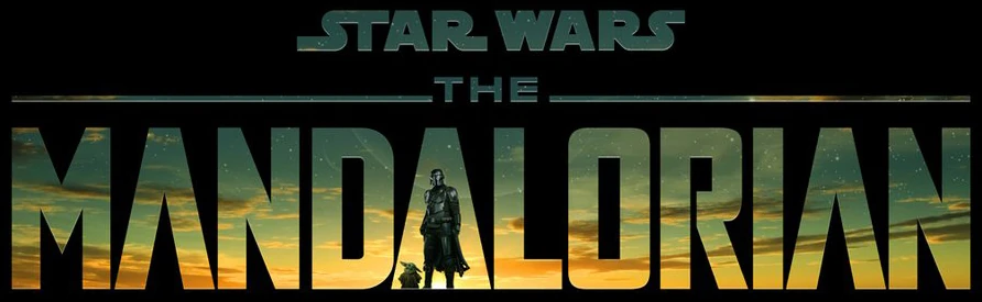
But when you open the project called The Mandalorian Season 3, it looks nothing like the logo above. And there are more than a couple of challenges to duplicating this logo. For one thing, finding that exact background-image is probably impossible. Notice that the background-image is behind the black overlay that has transparent letters which allow the background to show through. Tricky stuff, right? The alternative to finding or creating a similar background-image, was to create a linear-gradient that uses the same colors. Another problem is that the Mandalore font-family was created during Season 1, when Grogu (aka Baby Yoda) was not part of the logo yet. Nevertheless, when you download the three required font-families, then your project should look like this:
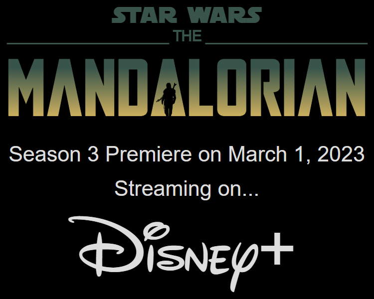
We hope you are excited, so let's dive in! Here is the download link to the SF Distant Galaxy Symbols by ShyFonts font. This font is required to create the Star Wars logo. Here is the download link to Iconian.com's Mandalore font. Of course, this font is required to create the Mandalorian logo. And lastly, here is the download link to font.download's Walto Neue font. It is perhaps needless to say that this font allows us to create the Disney logo. When you complete the task of downloading all three fonts, you will have three ZIP files called sf_distant_symbols.zip, mandalore.zip, and walto-neue.zip. In the next step, you will extract all the files inside each compressed zip file to separate folders. These three folders will be given the folder names of sf_distant_symbols, mandalore, and walto-neue. Now drag those three folders into your project. And... Voila! When you click on Go Live, the web page produced should look identical to the one above. Now that wasn't so hard, was it?
But let's take a long, hard look at the code here before we move on. The first thing to notice is that there isn't a whole lot of code in the index.html file. In fact, the head and the body are roughly the same size. But let's look closer at the h1 on line 18, and the h2 on line 20. You will notice that some of the letters are in uppercase, and some of the letters are in lowercase. In some fantasy fonts, this allows us to use special characters for some letters and not for others. If you are curious about this, try changing the lowercase r letters in Star Wars to uppercase to see the difference. Ah! Doing that ruins the official Star Wars logo. OK, understood. But let's also try changing the two lowercase a letters and the lowercase o letter in Mandalorian to uppercase to see the what happens. OK, we see why they are lowercase. Otherwise, we might get Mandoed to death. Now let's change them all back... all except the uppercase A in the middle.
Now let's look at the CSS code in the style.css external stylesheet. Lines 5 through 19 are the three @font-face methods that create our three fonts. We've seen similar TrueType fonts in the past, so this isn't anything new. Except on line 12, where there is commented-out code for an OpenType font. Golly Gee! Maybe we haven't seen an OpenType font used yet! So, let's uncomment line 12, and then comment out line 13. OK, so now the Mandalorian text is being displayed with an OpenType font instead of a TrueType font, but there really aren't many differences between the two. But if we look inside the mandalore folder, we find that there are 28 TrueType fonts, and 28 OpenType fonts with the same names. Obviously there is lot more we could do with this font-family.
Now let's look at line 70, where we defined our 'Distant Galaxy' font (and a few fallbacks) for our h1. Also, let's look at line 85, where we defined our 'Mandalore' font (and a few fallbacks) for our h2. Let us also take a gander at line 105, where we defined our 'Walto' font (and a few fallbacks) for our Disney logo (an h3 with a class of "walto"). In a few other places, we only needed some basic sans-serif fonts, so we define that on lines 77, 92, and 112. From lines 118 on, we added a couple of media queries to make this web page look better on mobile device screens.
Google Font Effects
In this last project, we just wanted to explore some font effects that are currently available for Google Fonts. According to them, these font effects are still in beta, but we were able to make several of them work across several different browsers, and it appears that the other ones that don't work are still in development. Please take a look at this link, which is where we found the documentation and code examples to create this web page. The only thing we found particularly surprising here is that these font-effects we applied to divs rather than headings (h1 - h6) or paragraphs. But they do appear to work just fine if you use them in that way. Anyway, we will let you explore the code behind this project on your own.
Font Awesome 6
Next, we will explore the free icons library that is available to you through Font Awesome 6. There is a newer 7.x version of Font Awesome, but they have changed the way you use Font Awesome, mostly as a ploy to help monetize their product. So for us, we will instead recommend using the final version of Font Awesome 6, and that is version 6.7.2 which offers you 2,060 icons that you can use for free. It also has 53,663 icons total if you are willing to pay a yearly fee to use them. However, if you are only using a few icons on your websites, and they are simple ones like social media logos, then Font Awesome 6.7.2 free icons is the way to go. And besides, you will soon learn that there are other options for free icons through websites like Iconify but we discuss those free options later.
To view a project that has examples of Font Awesome 6 free icons, simply click here.
Font Awesome icons are actual vector image fonts, like the ones we've been using all along. You can style them in much the same way as you would any font-family using CSS properties by assigning values to those properties. A couple of easy-to-understand examples of this are font-size and color. However, to add them to HTML, we use opening and closing <i></i> tags and assign class names to identify each one to identify them.
However, you should know that the HTML tags for italics, and the HTML tags for icon, are the same exact tags. To uncomplicate this issue, if you use these two tags without class names, and put text in between them, then that text will appear in italics, as in <i>italics</i>. But if you use these two tags with Font Awesome class names, and put no text in between them, then Font Awesome icons will appear, as in <i class="fa-brands fa-chrome"></i>, which produces the Font Awesome icon for Chrome.
Yes, that can be confusing, and it is just as confusing as the HTML tags for emphasis and the CSS em font-size units of measurement we discussed previously. For example, <em>emphasis</em> will produce text that has emphasis, which is usually italics, unless you use CSS to style it differently. And if you use font-size: 10em; in CSS, it means you are changing the font-size to the width of ten letter Ms in the default font-size.
And if that wasn't confusing enough, you should also know that in HTML, <i>italics</i> and <em>emphasis</em> both default to italics and emphasis, unless you style those elements to do something different in CSS.
Now let's get back to discussing Font Awesome 6. You can download the project files for the Fun With Font Awesome 6 project we linked above. Of course, you'll need to extract the files inside the ZIP file to a folder first. Then, if you open the files in that project with VS Code, you will see how we linked Font Awesome v6.7.2 to our project on line 7 of the index.html file. Notice how closely that link resembles the way we imported Google Fonts in the document head in previous projects. We link it as a CSS stylesheet, and it is always best to link it before you link your regular CSS external stylesheet, which we did in this project on line 9. And once that link is established, we can start using the opening and closing icon tags with class names that we can find on this web page.
Now let's look in the document body of the index.html file for this project. There are lots of open and closing icon tags with class names here, but let's first look at the first one on line 18. Inside the opening and closing h1 tags is a set of opening and closing i tags with three class names assigned to that icon: fa-solid, fa-gear, and fa-spin. All three of these class names were defined by the nice people at Font Awesome. The way you can tell is that each one begins with a prefix of fa- which we can only assume stands for Font Awesome. The first one called fa-solid is a specific type of icon (solid, as opposed to regular). The second class name is called fa-gear, which appears to be the icon's actual design. And if you click here and type gear into the search bar, and then press the enter key, it finds about 114 icons, but only the very first one is called gear. And if you move your mouse over that icon, the background color behind it will turn gold, and then if you click on it, a modal popup will appear with more information about that icon.
OK, the modal has some good information here. On the left side is a big picture of the gear. But on the right side in dark blue is some HTML code for this icon. And as expected, it is the opening and closing i tags with the first two classes of fa-solid and fa-gear. That third class of fa-spin is some code that we can add to make our icon spin, if this icon is a spinner. There are currently 28 free icons that can be used as spinners, and this fa-gear icon, and the fa-arrows-rotate icon on line 21 and 22, are both spinners. The font-size is inherited from the h1 element, because this icon is inline and a part of the h1 element, just like the other text that is here. If we look at the stylesheet, we will find that the font-size for this .container h1 on lines 22 and 23 is 32 pixels, and the color of this h1 is navy. The icon acts just like any other character inside the h1 element, and so it follows these rules.
As for the other parts of this h1 element, you will notice that this spinning gear icon is at the beginning and at the end, with the Font Awesome 6 text in the middle. And between the text and the two spinning gear icons, we have some space. Something you may never have seen before is the which is a special character that adds an extra space. In HTML, one of the rules is that you can only have one consecutive space in a string of text. Yes, you can type 50 spaces between two words, but when you want to display it on your web page, it will only show one space. The way we override this behavior is by using which stands for non-breaking space. We will discuss special characters in the very next section, so don't get too hung up on that right now.
Nevertheless, the main objective in creating this project was to give you a quick overview of the capabilities of Font Awesome, and the ease of selecting and using icons on your web pages. Notice in the other sections of this project how we used icons to represent all major operating systems, web browsers, and social media networking icons, as well as a chessboard complete with all the chesspieces. Below that is a crazy collection of emojis as well. If you mouse over some of the icons before the chessboard, you will see a title appear to identify what each icon represents, just in case you are unfamiliar with some of them. Look at the HTML code to see how those titles were added. Also, take a long hard look at the CSS stylesheet to see how each icon was given a color close to the official color used for each logo or icon. To do that, we used the one specific identifying class name that was assigned by Font Awesome. The one main exception to this rule is for the two icons for Chrome and Chrome OS. As you know, the official icon uses 4 colors, but there is no easy way to do this using Font Awesome. So a little bit of JavaScript code was used to continuously cycle through all four of the official Google Chrome colors every four seconds. Take your time to analyze this code. There are surely many ways that you can use free Font Awesome icons in your projects as well.
We also have one other project for you to look at that includes quick and easy instructions for incorporating Font Awesome icons into your own projects. And once again, we have a ZIP file that you can download and unzip as a separate project to see how this project was coded.
Lastly, Font Awesome is an amazing resource that has proven very useful to web developers over the past several years, especially their library of over 2,000 free icons. However, Font Awesome was designed originally as a money-making venture and that trend continues today. Nevertheless, Google Fonts has recently started to develop a set of free icons to compete with Font Awesome, and these icons can be used in much the same way as we used Google Fonts. So please take a look at this web page to see where Google is going with all of this, and you will probably see potential. And as briefly mentioned once before, Iconify has quickly taken the lead as a website that offers a plethora of free icons for you to use, so be sure to check them out as well. In fact, they offer so many choices that finding the icon you want may prove difficult as well. But for now, Font Awesome remains the dominant player, so you might want to stick with them... for now.
Special Characters
Aren't all the characters used on your web pages considered to be pretty special to you? Well, yes, we suppose they are. But here we use the term special characters to signify something entirely different. And to understand this completely requires an unavoidable (but short) course in computer science history.
In the beginning, there were no actual fonts used by computers. Everything was coded and displayed using plain text, and ASCII codes. ASCII stands for American Standard Code for Information Interchange. And that is a very long title for something that is extremely small. Back then, ASCII consisted of only 128 codes. Of these 128 codes, only 95 of them represented actual characters of text. The other 33 were used as control signals.
And this code system was numbered in a way that started with 0 and ended with 127. We wouldn't even bother to mention ASCII codes at all if they hadn't survived to be used in our modern HTML5 world. Here is a complete reference to the ASCII Character Set that explains it all much better than we can in a couple of paragraphs. But the main thing to know here is that, behind every character, there is an identifying number. The character we know as an uppercase A is known in ASCII code as the number 65. And the character we know as a lowercase z is known in ASCII code as the number 122. For that matter, the character we know as a comma is known in ASCII code as the number 44. And the character we know as the digit 8 is known in ASCII code as the number 56. Isn't that special?
But let's not forget that, while this character set was somewhat adequate for computer users who spoke American English, it was completely inadequate for people who spoke other languages, especially those languages that required (yes, you guessed it) special characters. The first improvement to this situation was the Windows-1252 character set which added another 128 special characters to the original ASCII character set, and that allowed for some words in other languages to be represented. For instance, you could now write Parque Nacional del Gran Cañón en español because there were now character codes to represent the letter ñ and the letter ó. But these 255 characters were quickly outgrown, as the world demanded more character sets to represent their native alphabets and languages. Dozens more were created to represent Greek, Hebrew, Arabic, Cyrillic, Turkish, Thai, Vietnamese... and the list of encoded character sets goes on and on. Things were very messy and complicated for decades.
Unicode®

However, our savior, namely the Unicode® Standard, was born in October 1991, and it quickly expanded and became accepted worldwide as it became more apparent that, only through international cooperation and the adoption of one standard, could all languages, alphabets, and special characters be fully implemented and represented. Fast-forward to October 2025, when we finally have Unicode® Standard 17.0 which today includes 159,801 characters and code points, with more on the way. In fact, the Unicode® Standard will support as many as 1,114,112 possible characters, so it appears that our needs are basically met... at least for quite a long while into the distant future.
But in order to wrap this discussion up as neatly as possible, it is important to know that HTML5 supports the Unicode® Standard through the use of the UTF-8 character set, and that the HTML5 specification strongly encourages web developers to use the UTF-8 character set. There are others, but after decades of wading through muddy waters, we won't bother to mention the others here. Look closely at almost all HTML documents and coding projects found here, and you will find that we almost always state this clearly on line 5 of every document <head> as: <meta charset="UTF-8">. That line means that this document uses the UTF-8 encoding method to represent characters in the Unicode® Standard.
የሚገርም
From here on out, we will use the term special character to refer to any character that cannot be easily represented by typing a key on our computer keyboard, and several that can. Always remember that any character in our UTF-8 character set can be represented by numbers and names just as easily as it can be represented by the actual character itself. And to illustrate this, click here to open the Special Characters project. And click here to download the code for the Special Characters project.
In Example # 1, this cryptic string of symbols and numbers is actual ASCII character code which, as you may recall, was incorporated into the UTF-8 encoding method for the Unicode® Standard. That encoded string of symbols and numbers will produce text that says Hello if you add it to any line of HTML. Try it, if you don't believe us!
In Example # 2, the cryptic string of symbols and numbers that is there actually renders የሚገርም, which translated from the Amharic language as written in the Ge'ez alphabet or Ethiopic script means amazing. And it is truly amazing that there are two free Google Fonts available to you if you ever need to publish text on the web in Ethiopic Script. There you will find Noto Sans Ethiopic and Noto Serif Ethiopic. Each character in a script like these Ethiopic Scripts is called a glyph. Both of these scripts have 566 glyphs available to you. And after you select the font, and then click on the Get font button, and then click on the actual font again, you can use the Type tester to select one of 800 possible font-weights on a scale of 100 to 900, and you can select a variable font width on a scale from 62.5 to 100, which you could specify in CSS by using the font-variation-settings: "wdth" (some number between 62.5 and 100);. However, you will most likely just use one of the 9 standard font-weights of 100 to 900, and the normal font width of 100, but it is nice that Noto fonts offer us so many possibilities. In fact, that's just የሚገርም!
But wait! You can't just start typing to get Ethiopic Script to appear on your web page, regardless of whether you import or download the font to do it. Right? Yes, that is correct. HTML5 is actually pretty amazing in that it will allow you to copy and paste almost any character in the UTF-8 character set without first assigning a font to display it. For instance, if you want to put the pile of poo emoji 💩 right in the middle of the text for your political opinion piece, HTML5 will certainly be obliged to do that for you.
Remember Rule #1: Any character in our UTF-8 character set can be represented by numbers and names just as easily as it can be represented by the actual character itself. And in the case of foreign language scripts with glyphs that you may be unfamiliar with, you should first import a beautiful font-family that works well with your other fonts, and second find the character codes for each and every glyph you will need to web publish a large block of foreign language content. The most accurate reference source for Unicode® v16.0 is most likely the official website code charts. It offers you downloadable PDF documents with maps of literally hundreds of foreign language alphabets and other symbols and special characters. But this alternative website is also rather complete and comprehensive, and you might find it easier to work with. Be sure to dig deep into both of these websites. They both contain treasure troves of great information if you need to display foreign languages, mathematical symbols, and a plethora of emojis, or other symbols and icons, etc.
Working with Unicode® can easily become overwhelming if you dive too deeply into it without first understanding all of the basics. If you aren't fluent in Amharic and have a complete understanding of the Ge'ez alphabet, then trying to lookup each and every character you need to write a blog in Amharic is completely out of the question! If this is your goal, then you should probably have a person who is fluent in Amharic send you a text document written in Ge'ez, and then all you have to do is to copy and paste the plain text into your HTML document, then select and use a nice-looking and appropriate Noto font-family to style it. And then, you can use some of your excellent CSS styling skills, to create a beautiful series of web pages that will attract any fluent Amharic reader.
Of course, another thing you can do is to use Google Translate if all you need is something like a basic welcome message in a foreign language and alphabet. For instance, typing Welcome Friends! in English will produce ¡Bienvenidos amigos! in Spanish, which you can then just copy and paste into your code, and you won't even need to know how to produce that upside-down exclamation mark at the beginning of the welcome message, ¿Lo entiendes?
Before we jump into the next section, and if you are somewhat unfamiliar with the hexadecimal numbering system, then you might want to follow our side tutorial on Numeral Systems where you will learn about all of the various numeral systems we use in computer science, especially the hexadecimal, decimal, and binary numbering systems.
A More Basic How-To Guide
But let's slow down and learn some helpful basics that will greatly expand your abilities to display text on the screen that isn't necessarily something you can easily type on your keyboard. And once again, we call these special characters. In Example # 1, we showed you how to produce the message Hello using special characters with ASCII values expressed by decimal numbers.
Let's break that down a little further, shall we? The first character in any special character string needs to be an ampersand (&). That tells HTML and your web browser that a special character is coming next. The second character in any special character string might be an octothorpe (#) if the special character is going to be represented by a number, rather than by a name. By the way, you may know the octothorpe by a different name like pound sign, hash tag, or number sign. It's all good (as we often say when it's not all good).
Now, hold onto your octothorpe! Because, if the second character in the special character string was an octothorpe (#), then a number will follow. And if that number is in the decimal numbering system, then it will be expressed as such. And the last character in any special character string is always a semicolon (;). So... the character we know as an exclamation mark ! can also be represented by !. And we hope that makes sense to you.
But we could have just as easily represented this special character in the hexadecimal numbering system. In that case, the character we know as an exclamation mark ! could also be represented by ! as well as by !. Yes indeed, if the third character in the special character string is an x, then the number that follows it is a hexadecimal number.
And just why exactly is that so important? Because you will find that Unicode® characters are most often represented in hexadecimal numbers in most documents that map out the glyphs in any script. That's why. And you will often see them written as U+ numbers, like U+12e8, which will be written by you as the የ special character. To convert any U+ code to a special character, all you have to do is replace the U+ with &#x, and then insert the hexadecimal number 12e8, and then end it with a semicolon (;). And so the result is that you just converted U+12e8 to special character የ, which is in a form that HTML and your web browser can display on your screen.
Was that a lot to grasp? Well maybe, but let's quickly review Example #2 of the Unicode® Special Characters project mentioned while discussing the Ethiopic Script. In that example, we showed you how to produce the Amharic word የሚገርም for amazing, and if you look closer at this special character string, you will see that all five characters of text are expressed as hexadecimal numbers which is just የሚገርም.
Named Special Characters
However, you will more often be using special characters for symbols that cannot be typed on your keyboard. Have you ever visited a weather website and wondered how they got that little ° degree symbol there? Or maybe you once saw fractions like ¼ or ½ or ¾ with a similar sense of wonder? Similarly with computers, we always use * as the sign for multiplication and the / as the sign for division, but the true mathematical symbols for each are × and ÷. And what do we do when we need to express amounts of currency in either € euros or ¥ yen? Of course the answer to all of the above is that we usually use special characters.
But it can be tedious work to look up cryptic Unicode® strings each and every time we need to use one of those symbols! So, a naming convention was devised to make it easier for us to remember the names of the ones we use most often. In fact, a list of the most commonly-used Named Special Characters was added to the bottom of the Special Characters project. So, click here to open that Special Characters project again. And click here to download the code for the Special Characters project as well.
Of course, you deserve an explanation of why the first four Named Special Characters appear on this list. After all, can't these characters be typed on your keyboard? And the answer is... "Yes! They can." But the <, and the >, and the & symbols are all characters that HTML relies upon to interpret your code. Each and every HTML tag starts with a < symbol and ends with a > symbol, and if you start adding them into the middle of your content code, HTML and your web browser might get confused and produce some unexpected results. For that reason alone, we generally use their named special character strings to prevent errors and confusion. Similarly, what does HTML think is coming next when it sees a &? If you've been reading this lesson and paying attention, you know that it means, "This is the beginning of a special character string," to HTML. And what it does with the characters in finds after that (until it finds the next semicolon) is anybody's guess. So once again, always used the named special character string for &, and you will avoid problems.
As for the named special character string, we mentioned once before that HTML will not process a long string of consecutive spaces (  in decimal, or   in hexadecimal). But please feel free to type 100 consecutive spaces, if you think that will add some margin or padding to your text, even though it actually won't. HTML will insert the first space into your text, and then it will ignore the next 99 spaces. And that is because margin and padding are only two of the tools we use to accomplish this. But another important one is the which is also known as the non-breaking space. And if you are wondering what it so special about the non-breaking space, and why it works while consecutive regular spaces do not, the answer is that it has a completely different UTF-8 character code. The code for a non-breaking space or is   in decimal, or   in hexadecimal.
The complete list of named special characters is far too long to include here. However, all can be easily located on the W3Schools Website. If you browse through the long list of character sets on the left side on the screen there, you will most likely find the named special character you are looking for in possibly the HTML WIN-1252 section, or perhaps in the HTML Symbols section, or maybe even in the Latin Supplement section. Look around! This is where you can find the specific named special character you are looking for, if one does indeed exist.
Rainbow Text
If you made it through all of this material, there should be some kind of a reward for all your hard work: kind of like finding a pot of gold at the end of the rainbow. For that reason alone, we've added this project to amuse you. It uses four different font families, a couple different kinds of linear-gradients, and some CSS animations. To explain everything that is going on in this project might take a lot of time and text. So if you are truly interested in seeing the code that makes all of this work, you should download and unzip this zip file. Thank you! Have fun!