CSS Coding Course
CSS 101
Part 4. The Big Picture
Classes and IDs
Previously, we began a discussion about class and id attributes, but we dropped the ball before we fully explained what they were and how to use them. The most important thing to know about both classes and IDs is that almost any HTML element can be assigned a class or an id. And the biggest difference between classes and IDs is that a class can be used by many different tags and elements all at the same time, while an ID should only be used by one.
Think of an ID like the card you carry with you for identification purposes (e.g. — your driver's license, for instance). There is only one person who is supposed to have a copy of that ID card, and anyone else who has one just like it is guilty of carrying a fake ID. And we all need to be ever vigilant to make sure that there are no duplicate IDs out there besides the one that belongs uniquely to each one of us alone. And the HTML and CSS rules for id attributes are very similar.
On the other hand, a class is an entirely different matter. Certain social classes of people drive different types of automobiles, based on their income levels. Not everybody is wealthy enough to drive a new 7-series BMW. But if you are the owner of one, your classy car might be uncommon on the roadways, but it certainly isn't unique. On the other hand, if you drive a Toyota Corolla, you probably see lots of cars just like yours on the roadways where you drive it. HTML and CSS rules for class attributes are similar in that many different tags can share the same class.
And you can specify a class or ID in the opening tag for almost any element. In fact, you can specify more than one class. But once again, you should never specify more than one ID. We will dive deeper into this topic after we talk about divs.
The All Important Div
There is no HTML tag on your web page that will add more organization and structure than a div. In fact, a well-designed web page will have many divs, and it will probably have several nested divs as well. Nested divs are divs that are contained inside of other divs. And knowing how to locate the opening and closing div tag for each and every div on your web page will become paramount in importance, as you shall soon see. And this is where that Beautify extension we installed with VS Code will become one of your most valuable tools for identifying and sorting these divs out. And you will employ the use of class and id attributes to help you locate and style each one.
The Divs Project
To better understand the topics of the div, the nested div, and the use of class and id attributes, we will need a project that uses all of the above. By now, you should be good at downloading and unzipping archive files, and then copying the folder they produce to the correct location. In this case, that will once again be the CSS Coding Course folder inside our Documents folder. So, click here to download the ZIP file, and we'll trust you to do the rest on your own.
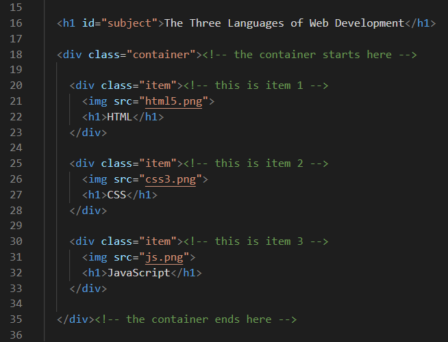
Now let's open this Divs Project in VS Code to learn more about the div, the nested div, and also about the class and id attributes. We will be mostly concerned with the index.html file and the style.css file. The image shown below contains the most relevant portion of the HTML document body (lines 16 through 35) in our index.html file. Notice that the code is commented to help explain what is happening there. And remember that you can always click on these images to zoom-in for a closer look.
The ID Attribute
First, let's look at line 16, which is not a div at all. It is an h1 heading. But this one is different from any of the h1 headings you've seen in the past because this h1 opening tag contains an id attribute named "subject". And if you look down the page at the rest of the code, you will see that there are three other generic h1 tags that do not have an ID attached to them. Yet basically all of these h1 tags are the same color and font-size. However, the one of line 16 has unique amounts of margin styling that the other three h1 elements do not require. So, this is a perfect example of when an id attribute should be used.
Inheritance
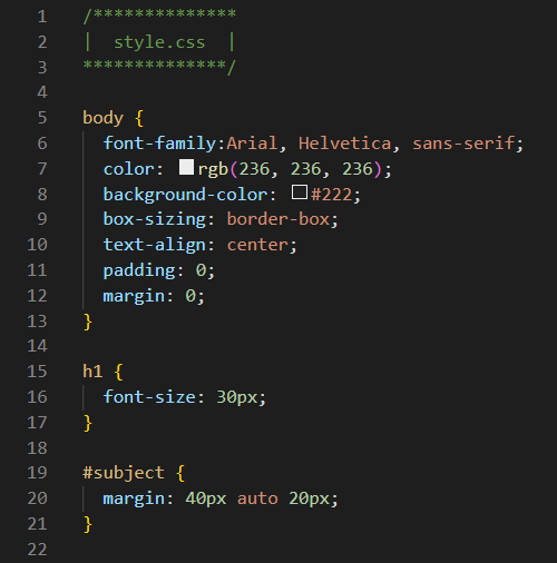
Now let's look at the top half of the style.css stylesheet. And the very first thing you will notice is that we have seven lines of CSS declarations for the body selector. And as you might have already guessed, these rules are applied to the document body. At this point, you don't need to know what all of these rules do, but it is important to see that the background-color is being styled with a certain shade of off-black, and that the text color is being styled with a certain shade of off-white. And since all of the other elements in this web page are inside of the opening and closing body tags in the index.html file, they will inherit these CSS rules as well. Eventually we will discuss inheritance and CSS reset in depth. But for now, just understand why we style the body before we style the rest of the elements.
We now understand why we don't need to add specific rules for the background-color, text color, and font-family for each and every h1 on our web page. But the CSS default font-size for an h1 is 32 pixels (or 32px). So, on lines 15 through 17, we made sure that all h1 elements on this page would be slightly smaller by assigning them a font-size of 30px. And on line 19, we specified a selector for the unique id of subject so that the h1 heading with that attribute will have unique margin settings, while the other h1 elements will accept either the default CSS settings, or margin settings they inherit from the CSS body rules. And if you look at line 12, you will learn how much margin the other three h1 headings will receive.
Another thing you need to know is that all HTML elements that we want to style will be referenced in CSS by the names of their HTML tags. In other words, all <h1> </h1> elements in the index.html file will be styled through the h1 { } selector and its associated declaration block in the style.css file. However, all HTML elements with id attributes that we want to style will be referenced in CSS by the names of their id attributes, preceded by a # to indicate that it is indeed the name of an id attribute. That is why the #subject { } selector on line 19 is there to identify the CSS declaration block for that id only. Similarly, all HTML elements with class attributes that we want to style will be referenced in CSS by the names of their class attributes, preceded by a . to indicate that it is indeed the name of a class attribute. That means that a selector that looks like .item { } is there to identify the CSS declaration block for that class attribute. We will see more examples of this in the next discussion.
The Class Attribute
Take another look at the index.html file, specifically lines 18 through 35. There are four divs here: one container div with three nested item divs inside the container div. Since these are classes instead of IDs, we could have as many container divs and item divs as we want on our web page. The comments should help you see that the container div starts on line 18 and ends of line 35 because that is where the opening and closing div tags are located respectively. And the opening tags for the item divs are on lines 20, 25, and 30, while the closing item div tags are on lines 23, 28, and 33. The blank lines between divs are there just to separate the divs to make them look pretty.
But wait! Don't all closing div tags look alike? How can we tell which closing div tag goes with which opening div tag? Well for one thing, if you properly autoformat your code with the Beautify (or Prettier) extension, your code will be indented so that all closing tags line up vertically with their opening tags. (See the light gray vertical lines that VS Code creates for you?) And if you don't know how to use the Beautify extension, you can always revisit that lesson in the HTML Crash Course at any time.
But the quickest way to find out which closing div tag goes with which opening div tag is to click your mouse on the actual <div> tag or </div> tag, and then VS Code will highlight its paired partner for you. In fact, this technique actually works for any HTML element that has both opening and closing tags (no exceptions). Try that out! See for yourself! Pretty cool, eh? And it goes without saying that for every opening <div> tag, there must also to be a closing </div> tag, and vice versa. If not, your HTML code will be broken, and your web page will not work properly.
Adding Styling to Divs
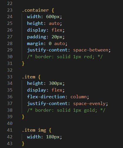
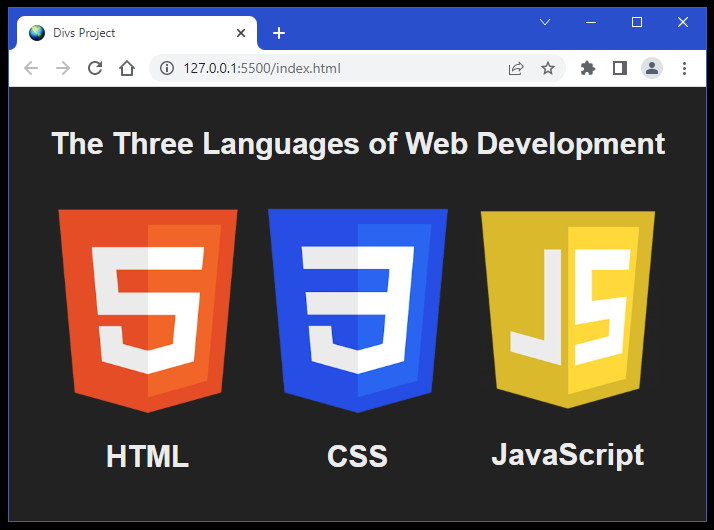
Once again, notice that our class attribute names must be preceded by a . to indicate to CSS that they are indeed the names of class attributes. For that reason, we have two class attribute selectors with accompanying declaration blocks for each one. The first one is for the .container div, and that selector is on line 23, and its declaration block ends on line 31. The second one is for the three .item divs, and that selector is on line 33, and its declaration block ends on line 39. Lines 41 through 43 are for styling all <img> elements inside of each .item div. But don't get too hung up on what each declaration property and value does at this point. We will get deeper into that later. Lastly, you will see two lines of code that are commented out so that they do not work. These are the two border declarations on lines 30 and 38. These are there just in case you want to see where these divs begin and end. And if so, simply uncomment them by removing the /* before the code, and also the */ after the code. If you do that, then borders will appear around the four divs, which is often our preferred way to troubleshoot divs when they don't behave the way we think they should. If you do not uncomment the two border declarations, then your web page should look very much like the one below when you Go Live.
The Devil is in the Details
Now that we know a little bit about the div and the class and id attributes that allow us to style them, we should learn more about how these divs fit into our HTML document as content in our document body. The easiest way to see this is through a couple more new projects.
This first new project is called Parts of a Webpage, and you can view it by clicking on the link provided earlier in this paragraph. Through a rather ingenious scheme of tiled and colored background images, we are able to clearly illustrate these various parts of a webpage: the html document in light blue, the document body in light pink, a div that has a class called container in light yellow, and four nested divs inside the container that each have a class called item in light green. Please notice how the tiled background image for each div is labeled with a name that is recognized and styled by CSS through your web browser. To see exactly how this is done, you can download and unzip this zip file into your CSS Coding Course folder, and then open it with VS Code.
Let's look at the code in the index.html file first. The HTML code in this file is actually pretty basic. Our html document begins on line 2 and ends on line 27. There is really nothing of interest in the document head, with the possible exception of us using two stylesheets rather than one. And if that does interest you, we are using a file called reset.css to do a CSS reset before loading our regular stylesheet file called style.css. But don't get too hung up on that. The next important area of interest is the document body which begins on line 15 and ends on line 25. Inside the document body is a div that has a class called container. It starts on line 17 and ends on line 22. And nested inside of the container div are four divs each with a class called item. Each one of these divs start and end on the same lines of 18, 19, 20, and 21.
But the real magic happens in the style.css file. We did get a little bit of help setting the height of the html document and the document body from lines 15 through 18 in our reset.css file. Nevertheless, the other CSS rules for the html document appear on lines 5 through 11 of our style.css file. Similarly, the rules for the document body are found on lines 13 through 27 of our style.css file. And it should be easy to spot the rules for the container div on lines 29 through 41, and the rules for all item divs on lines 43 through 54. You also might notice that each element was given a border that matches the color of the background-image text, and that a box-shadow was added to give each element a three-dimensional effect. Lastly, this webpage can be resized to almost any height and width, making it mobile-reponsive so that it can be viewed on almost any device. And that little bit of magic is accomplished through the use of flexbox CSS rules used on these elements. You will eventually learn more about flexbox. However, the main purpose for this project was to show you that the html document and the document body are completely separate parts of your webpage, and that each div is a separate elemental entity as well. But for now, let's just move on to our second project that will require your skills and participation in coding it.
The second new project is called More Parts of a Webpage, and you can view it by clicking on the link provided earlier in this paragraph. But wait! That webpage looks terrible and needs some serious help! And it will be our job in this next exercise to make it look like this webpage. But before we can do that, we must download and unzip this zip file into your CSS Coding Course folder, and then open it with VS Code. Once we accomplish that, we are ready to move on to the next step.
Since we will not be changing any of the HTML code, let's take a look at the index.html file, and let's also open it in our browser window by clicking on Go Live in the lower right-hand corner of our VS Code screen. In a similar color scheme to our previous project, we have given background colors to the various parts of the webpage. The html document is light blue, the document body is light pink, and the four nested block-element divs all have a background color of light yellow, which is actually called "lemonchiffon". You will also notice that each block-element div has a red dashed border and a solid black outline. We did this to show you that borders are on the inside edge of each div, but the outline is actually on the outside of each div. This will be inportant information to know when we get to the next project after this one.
The only things that are worthy of mentioning with this HTML code is that we are not using a reset.css file. All styling will be done by CSS in the style.css file which is linked on line 9. One other element worth mentioning is the fourth block-element div on lines 19 through 23. Notice that we gave it a second class name called center. And as usual, the link to the JavaScript file on line 28 points to an empty file, so we can just ignore that.
Now let's look at the style.css CSS stylesheet file. Since we did not do a CSS reset by using a reset.css file like we did in the previous project, we are basically using the Default CSS rules that we learned about in Part 2 of this CSS 101 Coding Course. And as we already learned, those rules are not always optimal for what we actually want to do. So we have the beginnings of some CSS reset rules on lines 5 through 7 of this style.css file. Notice that on line 5, we are defining property values for the three elements of *, html, and body. The * is called a wildcard, which means all elements on the webpage. Along with that, we added in the html document and the document body. This technique of doing CSS resets is actually a common practice for professionals, and that is why we are learning about it now. But as you can see, so far our only definition is for a list of preferred font families for all elements on this webpage. Of more importance to us at this point are the various background-color rules on lines 10, 14, and 20. And lines 21 and 22 define the border and outline rules we mentioned earlier for each block-element div.
Now before we add the first line of code, let's take a long hard look at everything that is wrong, and then we can decide which CSS element properties we need to change in order to make it look like our desired webpage.
Our first most glaring observation is that our webpage is mostly light blue when it should be light pink and light yellow! And the reason why this is so is because of the Default CSS rules we mentioned earlier. By default, the html document has a width of 100% and a height of 100% of the web browser's viewport. And it also "bequeaths" a little bit of margin to the document body as inheritance by default. On the other hand, the Default CSS width rules for the document body (and the other divs inside the body for that matter) are 100%. But by default, the height of the body is only as large as it needs to be to contain the other elements that are inside of it. And that explains why the body and divs are all crammed together at the top of the webpage. However, we can fix this problem by setting the body height to 100% of the viewport (or 100vh). And if there is any light blue still showing around the edges, we can set the html margin to 0.
So let's do those two things first then. Let's open our style.css file, and then click at the end of line 14 and press the Enter key on our keyboard to create a blank line on line 15. Then we can add height: 100vh; to line 15 and then look at the results through Go Live in our web browser. Wow! What a huge difference that made! The document body and the divs inside of it have expanded to cover most of the height of the webpage. But we now have a little bit of light blue around the edges of the body and a vertical scrollbar on the right side of our webpage. But remember that we already know this is being caused by the Default CSS rules. So let's fix that next. Let's click at the end of line 6 and press the Enter key on our keyboard to create a blank line on line 7. Then we can add margin: 0; to line 7, and then take another look at our webpage. Ah! That seemed to fix both of those problems! The light blue along the edges has disappeared and so has the the unwanted scrollbar. The lesson here is that a CSS reset can be as simple as removing the margin from the html document, the document body, and all of the elements on our webpage. And that's what we just did with one simple line of code.
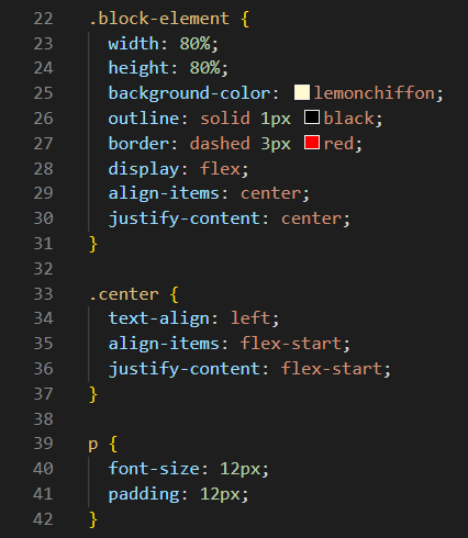
Now let's look at the code for our four nested block-element divs on lines which are now on lines 19 through 25, after the two lines of code that we just added. The first thing to know is why we called the class for these divs block-element. We could have called them anything we wanted, but we chose that class name because all divs have the built-in CSS rule of display: block; by default. And you may be wondering why the div rule height: 80%; did not seem to do anything. And the reason for that is because these divs had no height to inherit from the body, which all changed the microsecond we gave the body some height.
But getting back to our default block-element divs, we can change the display property value from block to some other value like flex. So let's do that for not only the block-element divs, but also for the body. Let's click at the end of line 16 and press Enter, and then add display: flex; to line 17. And let's also click at the end of line 25 and press Enter, and then add display: flex; to line 26. But if you look at the results, you will see no difference. And the reason why there is no change is because flexbox has two Default CSS rules of align-items: flex-start; and justify-contents: flex-start;. Of course for block elements, the text-align property defaults to text-align: left; so it should be no surprise that flexbox elements do something similar by default. But we can fix that.
So now we will click at the end of line 17, press Enter, and the add align-items: center; on line 18. And then, click at the end of line 18, press Enter, and the add justify-contents: center; on line 19. When you are done, let's look at the results. Look how all of the nested divs are noe centered perfectly in the middle of our webpage!
But we can do the very same thing for those nested divs as well. So now we will click at the end of line 28, press Enter, and the add align-items: center; on line 29. And then, click at the end of line 29, press Enter, and the add justify-contents: center; on line 30. When you are done, let's look at these results.
But there are still a few things that don't match our our desired webpage. Our paragraph inherited these centering rules from the divs, and we didn't really want that. So that is why the innermost div also has a second class name of center, so if we add the code for that class, then the paragraph with no longer inherit those centering rules. And lastly, a little bit of padding will help as well. Below is a listing of the code that finishes this project. Add it, check your results, and then we will be ready to jump into the next part that will expand on what we just learned.
One huge bonus we received from completing this project is that we got a quick introduction to flexbox, which is a handy tool that we will use many times in the future! And we learned a great deal about the various parts of a webpage, its default CSS values, and how we can reset those default values to something that is more desirable to us as web developers. So when you are satified with what we accomplished in these last two projects, then click on the button below and we can dive into Part 5. The Good Stuff.